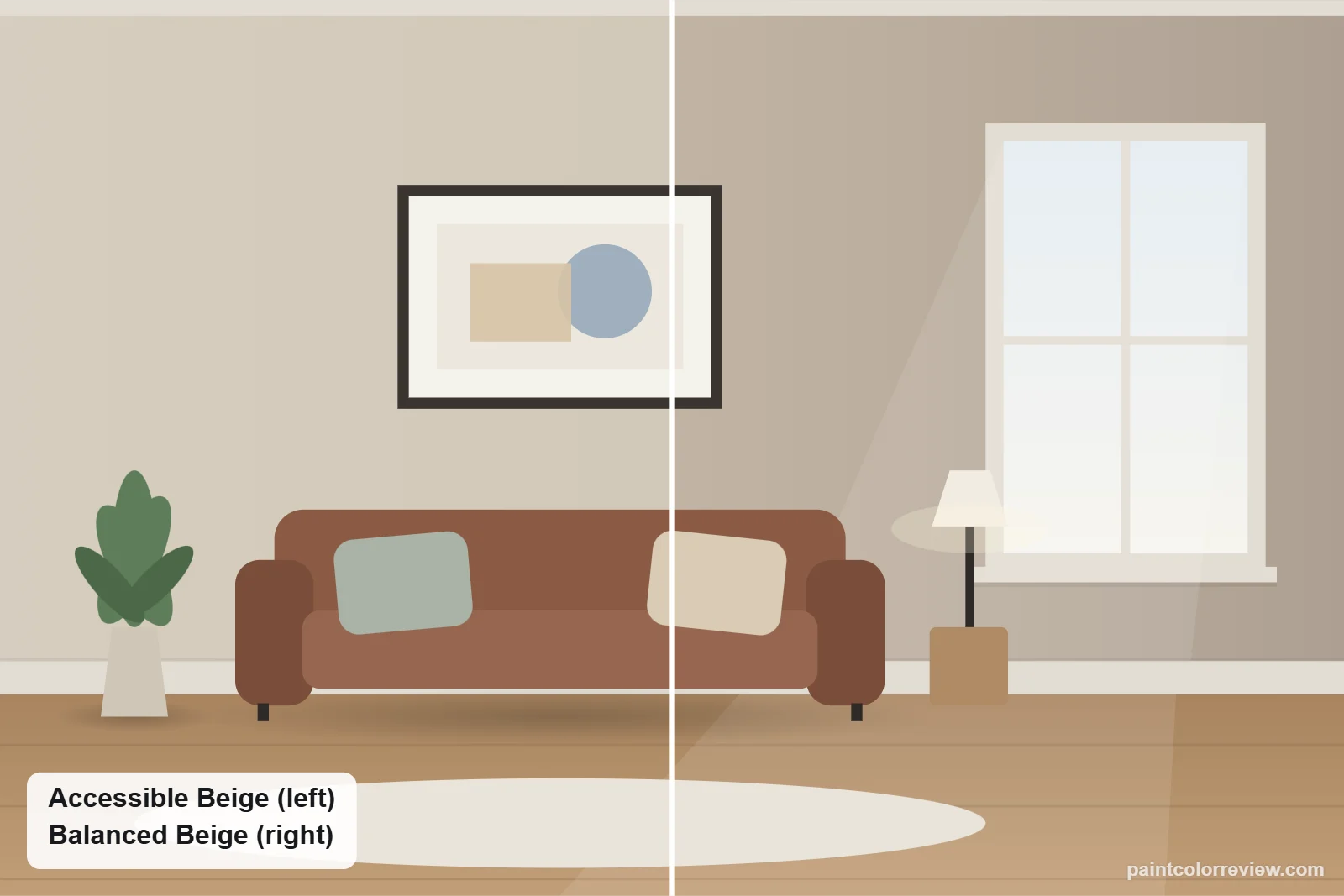
Accessible Beige (SW 7036) and Balanced Beige (SW 7037) sit next to each other on the same Sherwin-Williams strip. Balanced Beige is the next step darker, so this is really a choice about depth.
Side-by-side numbers
| Accessible Beige | Balanced Beige | |
|---|---|---|
| Brand | Sherwin-Williams | Sherwin-Williams |
| Code | SW 7036 | SW 7037 |
| Hex | #D1C7B8 | #C0B2A2 |
| RGB | 209, 199, 184 | 192, 178, 162 |
| LRV | 57.7 (lighter) | 45.6 |
| Yellow–blue (b*) | +8.7 | +10.0 (warmer) |
| Green–red (a*) | +0.9 | +2.3 |
| Difference (ΔE) | 5.6 |
Hex, RGB and LRV from the manufacturers' color records. CIELAB values and ΔE (CIEDE2000) calculated from those hex values.
The difference is clear: Accessible Beige has an LRV of 57.7, Balanced Beige 45.6, and the ΔE of 5.6 means they never look the same.
Undertones: Accessible Beige vs Balanced Beige
Balanced Beige is warmer and has a stronger warm-red lean (yellow–blue +10.0, green–red +2.3), so it reads as a warm taupe. Accessible Beige (+8.7, +0.9) is a lighter beige with a gray base.
How they compare in each light
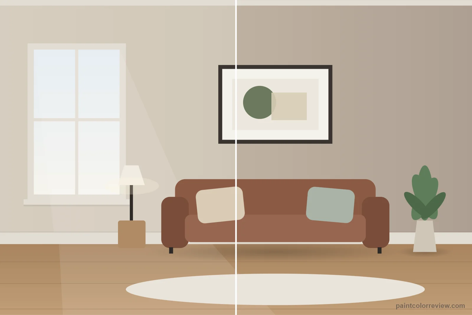
Balanced Beige needs good light; in dim north rooms it can feel heavy. Accessible Beige works in more rooms.
Simulated from the manufacturer's color values. Always test samples in your own light.
Which one fits your room?
Choose Accessible Beige if…
- You want a light-to-mid beige for whole rooms
- The room is average or dim
- You want a gray base to keep it fresh
Choose Balanced Beige if…
- You want a deeper, cozier taupe
- The room is bright and large
- You want an accent wall, cabinets or exterior body color
Using them together
Because they share a strip, they pair naturally: Accessible Beige on walls with Balanced Beige on an accent wall, island or exterior trim, and Aesthetic White on trim and ceilings.
Room by room: where Accessible Beige and Balanced Beige each work
Living rooms
Accessible Beige is the lighter of the two (LRV 57.7 against 45.6) and works as an all-over living room color. Balanced Beige is considerably deeper and warmer, better as an accent wall, in a large bright room, or where you want a rich, cozy feel.
Bedrooms
Balanced Beige makes a warm, enveloping bedroom in good daylight. In a small or north-facing bedroom it can feel heavy; Accessible Beige keeps the room lighter.
Kitchens and cabinets
Balanced Beige works well on an island or lower cabinets against Accessible Beige or white walls. As an all-over kitchen wall color, Accessible Beige keeps the room brighter.
Bathrooms
Balanced Beige can make a windowless bathroom feel dark. Accessible Beige is the safer choice for small bathrooms.
Exteriors
Accessible Beige is rated by Sherwin-Williams for exterior use. Outdoors, Balanced Beige's depth helps it hold a clear beige color in full sun, where lighter beiges can wash out.
Trim and colors to pair with each
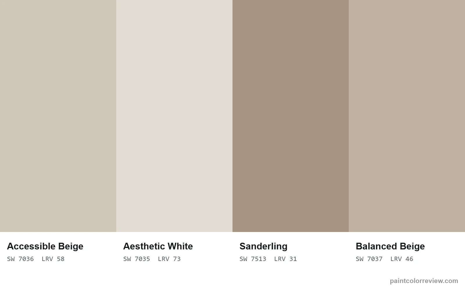
Sherwin-Williams lists Aesthetic White (SW 7035) as a coordinating color for Accessible Beige, which also works as a trim for Balanced Beige walls.
Coordinating colors listed by the manufacturers:
- Accessible Beige: Aesthetic White (SW 7035), LRV 73.1; Sanderling (SW 7513), LRV 31.4; Cadet (SW 9143), LRV 31.2
If neither is quite right
If you want something between the two, or lighter, deeper or warmer than both, the table shows the nearest color in each direction.
| Direction | Color | Brand | LRV | ΔE to Accessible Beige | ΔE to Balanced Beige |
|---|---|---|---|---|---|
| Lighter | Symmetry (SW 9601) | Sherwin-Williams | 60.6 | 1.4 | 6.6 |
| Darker | Perfect Khaki (SW 9612) | Sherwin-Williams | 38.2 | 9.5 | 4.1 |
| Warmer | Portico (SW 7548) | Sherwin-Williams | 41.8 | 7.9 | 3.0 |
Read the full reviews
Accessible Beige vs Balanced Beige FAQs
Is Balanced Beige darker than Accessible Beige?
Yes, clearly: LRV 45.6 against 57.7. It is the next color down on the same strip.
Do Accessible Beige and Balanced Beige go together?
Yes. Use Accessible Beige on walls and Balanced Beige for an accent wall, island or exterior trim.
Which is warmer?
Balanced Beige, with more yellow and red (b* 10.0, a* 2.3 against 8.7 and 0.9).
Can Balanced Beige work as an accent wall with Accessible Beige?
Yes. Their difference of 5.6 is large enough to read as a deliberate contrast.