What is greige?
A greige is a gray with a beige base. It sits in the middle of the neutral range, which is why it works with both warm finishes (wood, brass, cream) and cooler ones (marble, chrome, white). Measured, most greiges have a moderate warmth: a yellow–blue value (b*) roughly between +5 and +9.
Light, mid and deep greiges
Light greiges (LRV 63–70) such as Pale Oak, Balboa Mist, City Loft and Drift of Mist keep rooms airy and are easy whole-house colors.
Mid greiges (LRV 55–63) such as Agreeable Gray, Gossamer Veil, Edgecomb Gray and Revere Pewter give walls clear color and make white trim stand out.
Deep greiges (LRV under 55) such as Pashmina work for cabinets, islands and cozy feature walls.
Warmer vs grayer greiges
Within the same lightness, greiges differ in warmth. Agreeable Gray (b* +5.7) and Pale Oak (+5.9) read grayer; Revere Pewter (+7.6), Edgecomb Gray (+8.2) and Accessible Beige (+8.7) read more beige. Pick grayer greiges for cool finishes and warmer ones for warm woods and north-facing rooms.
Building a greige color palette
A simple, reliable palette uses one greige on most walls, a soft or clean white on trim and ceilings, and one deep color (charcoal, navy or deep green) for doors, an island or exterior shutters. Keep the whole palette at a similar warmth so nothing clashes.
The best greige paint colors, one by one
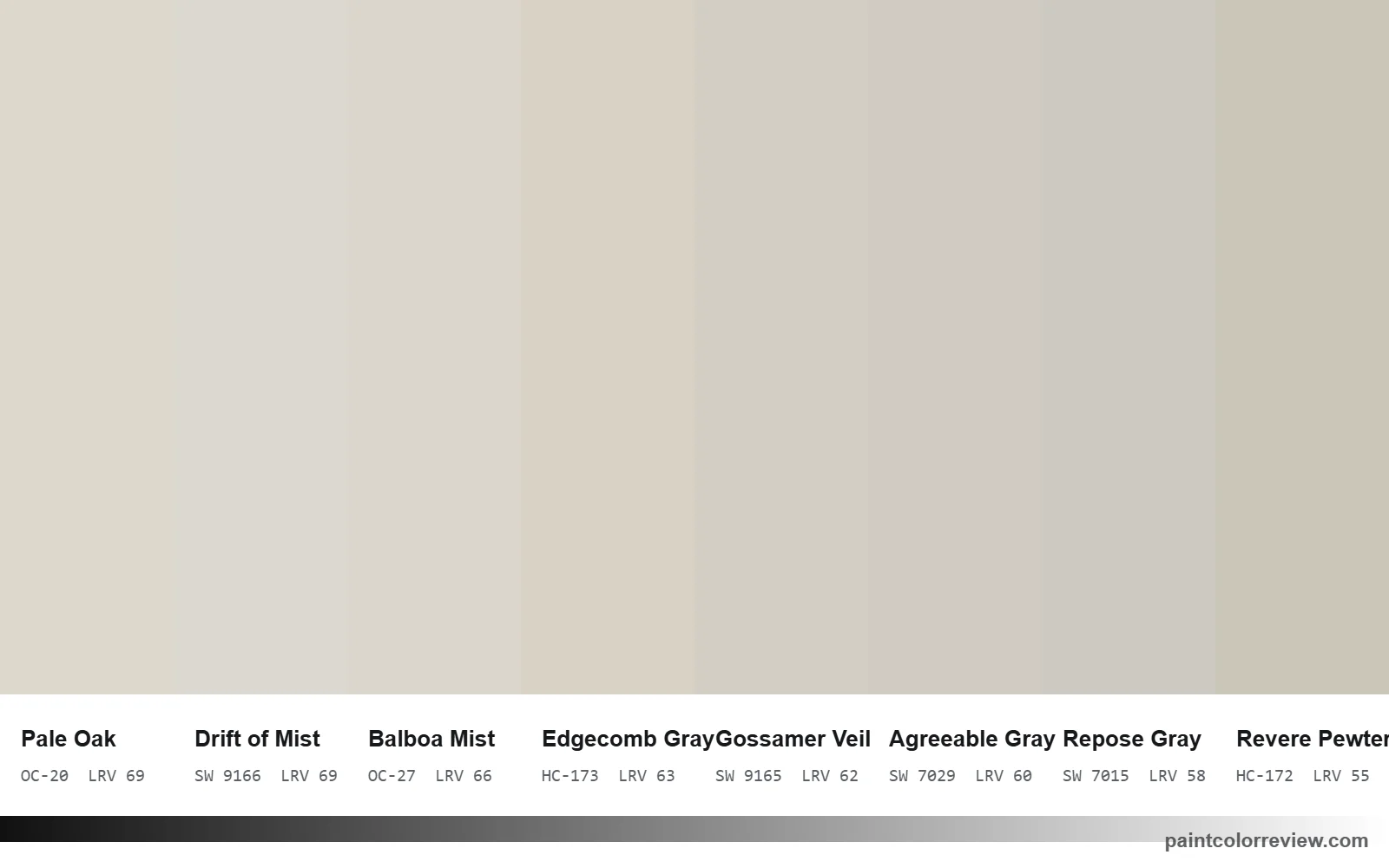
Agreeable Gray (SW 7029)
Agreeable Gray review: The benchmark greige. At LRV 60.4 with a nearly neutral green–red value (+0.3), it reads as a soft gray with a little beige, which is why it works in so many homes and as an all-over color.
Revere Pewter (HC-172)
Revere Pewter review: Deeper (LRV 55.05) and warmer than Agreeable Gray, with a slight green lean. It gives walls more presence and suits traditional rooms with wood and white trim; in a dim room it can feel heavy.
Pale Oak (OC-20)
Pale Oak review: A light greige (LRV 68.64) that sits close to an off-white. It keeps rooms airy while still reading as a color against crisp white trim.
Balboa Mist (OC-27)
Balboa Mist review: Pale Oak's slightly deeper, grayer twin; the two are only 0.8 apart, so the choice rarely matters. It suits mixed-finish homes where you want a quiet neutral.
Edgecomb Gray (HC-173)
Edgecomb Gray review: One of the warmest light greiges here (yellow–blue +8.1). It flatters warm floors and cream textiles but reads beige next to cool gray tile.
Natural Cream (OC-14)
Natural Cream review: Similar warmth to Edgecomb Gray with the strongest green lean in this group (−0.9), which gives it a soft, slightly stony look.
Gossamer Veil (SW 9165)
Gossamer Veil review: Almost the same color as Agreeable Gray and perfectly balanced on the green–red axis (0.0). A good pick if Agreeable Gray looks a touch pink in your light.
Drift of Mist (SW 9166)
Drift of Mist review: The lightest Sherwin-Williams greige on this page and one of the grayest (+4.4 warmth). It reads as an off-white in bright rooms.
City Loft (SW 7631)
City Loft review: A warm off-white greige (LRV 70.5) for homes where white feels stark and Agreeable Gray feels too dark.
Egret White (SW 7570)
Egret White review: Similar lightness to City Loft with a little more warmth; it reads as a soft warm white in good light and a pale greige in dim rooms.
Accessible Beige (SW 7036)
Accessible Beige review: The most beige of this group (+8.7 warmth, +0.9 red). Choose it for warm, cozy rooms with wood and leather; avoid it with cool gray finishes.
Pashmina (AF-100)
Pashmina review: A deep, warm greige (LRV 44.2) for cabinets, islands and feature walls rather than whole rooms.
Repose Gray (SW 7015)
Repose Gray review: The grayest greige here (+4.8 warmth) with a slight green lean. It borders on a true gray and suits cool finishes, black metal and marble.
Mindful Gray (SW 7016)
Mindful Gray review: Repose Gray's deeper strip-mate (LRV 47.7). Balanced and slightly warm, it works on islands, accent walls and exteriors.
Greige undertones: green, beige or pink?
Greiges differ in two ways: how warm they are (the yellow–blue value, b*) and whether they lean green or pink (the green–red value, a*). On the map below, colors left of the center line lean green, and colors right of it lean pink or red. Natural Cream (−0.9), Revere Pewter (−0.7) and Repose Gray (−0.6) are the greener greiges; Accessible Beige (+0.9) is the one with a visible warm-red lean; Agreeable Gray, Gossamer Veil and Drift of Mist sit almost exactly on the line.
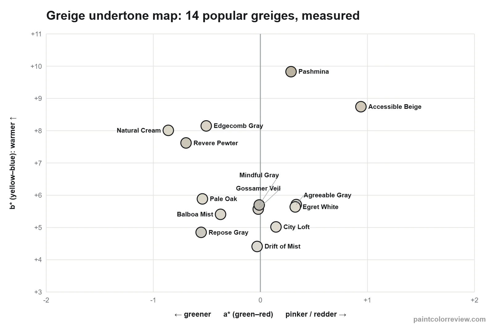
If a greige looks green in your room, move right on the map (Agreeable Gray or Gossamer Veil). If it looks pink or peachy, move left (Balboa Mist or Pale Oak). For how to judge undertones in person, see the paint undertones guide.
How light changes greige
North-facing rooms get cool, bluish light that strips warmth out, so grayer greiges like Repose Gray can read as plain gray and the greener ones look greener. Warmer greiges such as Edgecomb Gray or Accessible Beige hold up better there. South- and west-facing rooms add warmth, which pushes beige-leaning greiges toward tan; grayer greiges like Agreeable Gray or Repose Gray stay balanced. Bulbs matter as much as windows: warm 2700K bulbs make every greige look warmer at night.
Best trim colors for greige walls
Trim reads as crisp or soft depending on how far apart the two colors are. The table shows how much lighter each white is than the wall (LRV) and the measured color difference (ΔE). A bigger gap means sharper trim lines.
| Greige wall | Extra White trim | Chantilly Lace trim | Pure White trim | White Dove trim |
|---|---|---|---|---|
| Pale Oak (LRV 68.6) | +17 LRV, ΔE 5.7 | +21 LRV, ΔE 7.1 | +15 LRV, ΔE 4.8 | +15 LRV, ΔE 4.8 |
| Agreeable Gray (LRV 60.4) | +26 LRV, ΔE 8.7 | +30 LRV, ΔE 10.2 | +24 LRV, ΔE 7.8 | +23 LRV, ΔE 8.1 |
| Edgecomb Gray (LRV 63.1) | +23 LRV, ΔE 7.8 | +27 LRV, ΔE 9.1 | +21 LRV, ΔE 6.9 | +20 LRV, ΔE 6.6 |
| Accessible Beige (LRV 57.7) | +28 LRV, ΔE 10.6 | +32 LRV, ΔE 12.0 | +26 LRV, ΔE 9.6 | +25 LRV, ΔE 9.7 |
| Repose Gray (LRV 58.2) | +28 LRV, ΔE 8.9 | +32 LRV, ΔE 10.3 | +26 LRV, ΔE 8.1 | +25 LRV, ΔE 8.4 |
| Revere Pewter (LRV 55.0) | +31 LRV, ΔE 10.3 | +35 LRV, ΔE 11.6 | +29 LRV, ΔE 9.4 | +28 LRV, ΔE 9.4 |
Chantilly Lace or Extra White give the crispest, most modern edge. Pure White and White Dove are softer and suit warmer greiges such as Edgecomb Gray and Accessible Beige, where a stark white can make the wall look yellow.
Colors that go with greige
The paint brands list coordinating colors for each greige, and they follow a clear pattern: a soft white for trim, a mid-tone neutral, and one deeper accent. Agreeable Gray is listed with Extra White and Incredible White plus a muted coral; Revere Pewter with White Dove and the deep Chelsea Gray; Repose Gray with Eider White and the darker Pavestone; Accessible Beige with Aesthetic White, the warm taupe Sanderling and the blue-gray Cadet. In practice greige works best with navy, charcoal, muted green or blue accents, natural wood, and either brass or black hardware.