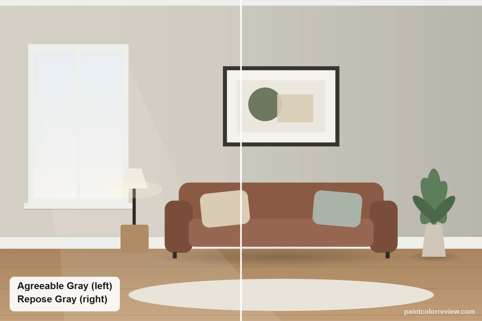
Agreeable Gray (SW 7029) and Repose Gray (SW 7015) are Sherwin-Williams' two most-compared neutrals. On a chip they look almost the same; on a wall, one reads as a warm greige and the other as a soft gray. Here is exactly how they differ.
Side-by-side numbers
| Agreeable Gray | Repose Gray | |
|---|---|---|
| Brand | Sherwin-Williams | Sherwin-Williams |
| Code | SW 7029 | SW 7015 |
| Hex | #D1CBC1 | #CCC9C0 |
| RGB | 209, 203, 193 | 204, 201, 192 |
| LRV | 60.4 (lighter) | 58.2 |
| Yellow–blue (b*) | +5.7 (warmer) | +4.8 |
| Green–red (a*) | +0.3 | −0.6 |
| Difference (ΔE) | 1.6 |
Hex, RGB and LRV from the manufacturers' color records. CIELAB values and ΔE (CIEDE2000) calculated from those hex values.
The colors are very close: a ΔE of 1.6 means most people only see the difference with the two side by side. Agreeable Gray is slightly lighter (LRV 60.4 vs 58.2).
Undertones: Agreeable Gray vs Repose Gray
Agreeable Gray is the warmer of the two, with more beige (yellow–blue +5.7 vs +4.8). Repose Gray has a faint green-gray lean (green–red −0.6), while Agreeable Gray is neutral on that axis (+0.3). That is why Agreeable Gray reads as greige and Repose Gray as a cooler, cleaner gray.
How they compare in each light
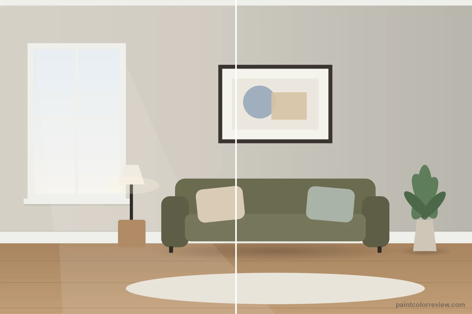
The gap stays small in every light, but north light pulls Repose Gray toward a cool stone gray sooner, while Agreeable Gray keeps a little warmth. In south and west light both warm up and look even closer.
Simulated from the manufacturer's color values. Always test samples in your own light.
Which one fits your room?
Choose Agreeable Gray if…
- Your floors, wood or fabrics are warm (oak, tan, cream)
- The room faces north and you want it to stay warm
- You want a gray that never feels cold
Choose Repose Gray if…
- Your finishes are cool (white marble, chrome, blue-gray)
- You want walls to read as gray, not beige
- You like a slightly deeper wall next to bright trim
Can you use both in one house?
Yes, in connected rooms, but not side by side as an accent: the difference is too small to look intentional. For a real accent, step down to Mindful Gray (on Repose Gray's strip) or Anew Gray (on Agreeable Gray's).
Room by room: where Agreeable Gray and Repose Gray each work
Living rooms
In an open-plan living space with wood floors, tan leather or brass, Agreeable Gray is the easier fit: its slight warmth keeps it from looking cold next to warm materials. Repose Gray shines with gray, black and crisp white furnishings, where its cooler cast reads as a clean, modern gray.
Bedrooms
North-facing bedrooms push Repose Gray toward blue-gray, especially at night under cool bulbs, while Agreeable Gray holds a soft greige. A bedroom that gets strong late-afternoon sun is the opposite case: Repose Gray balances the orange light, and Agreeable Gray can tip toward beige.
Kitchens and cabinets
Both keep a kitchen bright, since their LRVs are only 2.2 points apart. Agreeable Gray suits butcher block, cream tile and warm brass hardware; Repose Gray suits marble, cool white quartz and chrome or matte black hardware. On cabinets, either works best with a clean white counter rather than a yellow-cream one.
Bathrooms
Small bathrooms run on artificial light, so choose by bulb. Warm 2700K bulbs flatter Repose Gray and stop it feeling chilly; cooler 4000K bulbs suit Agreeable Gray and keep it from looking beige.
Exteriors
Sherwin-Williams rates both for exterior use. Full sun washes both lighter, and Agreeable Gray then reads as a warm off-white, while Repose Gray still reads as light gray. If you want siding that clearly looks gray, Repose Gray is the safer choice.
Trim and colors to pair with each
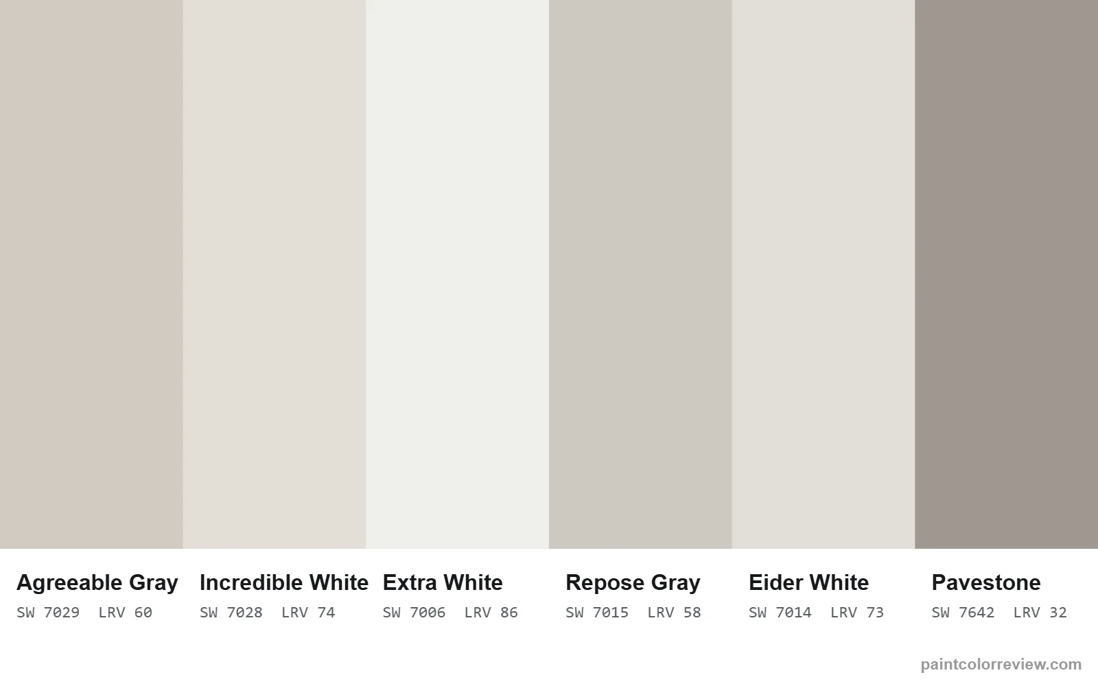
For trim, a clean white keeps both looking intentional. Extra White (SW 7006) is one of the coordinating colors Sherwin-Williams lists for Agreeable Gray, and its neutral, bright character suits Repose Gray as well. For accent walls or a front door, Agreeable Gray's warmth carries terracotta and clay tones, and Repose Gray handles navy and charcoal especially well.
Coordinating colors listed by the manufacturers:
- Agreeable Gray: Incredible White (SW 7028), LRV 73.6; Extra White (SW 7006), LRV 85.9; Coral Rose (SW 9004), LRV 28.3
- Repose Gray: Eider White (SW 7014), LRV 73.2; Pavestone (SW 7642), LRV 32.3; Coral Clay (SW 9005), LRV 26.0
If neither is quite right
If Agreeable Gray feels too warm and Repose Gray too cool, look for a gray that sits between them on the yellow–blue axis; if both feel too dark or too light, move along LRV instead. The table shows the nearest color in each direction from our database.
| Direction | Color | Brand | LRV | ΔE to Agreeable Gray | ΔE to Repose Gray |
|---|---|---|---|---|---|
| Lighter | Modern Gray (SW 7632) | Sherwin-Williams | 62.5 | 1.2 | 2.8 |
| Darker | Revere Pewter (HC-172) | Benjamin Moore | 55.0 | 2.5 | 2.3 |
| Warmer | Useful Gray (SW 7050) | Sherwin-Williams | 59.1 | 1.7 | 1.8 |
| Cooler | Front Porch (SW 7651) | Sherwin-Williams | 60.2 | 3.0 | 1.7 |
Read the full reviews
Agreeable Gray review · Repose Gray review
Agreeable Gray vs Repose Gray FAQs
Is Repose Gray darker than Agreeable Gray?
Slightly: LRV 58.2 against 60.4. Most people only notice side by side.
Which is warmer, Agreeable Gray or Repose Gray?
Agreeable Gray. It has more yellow (b* +5.7 vs +4.8), which reads as beige warmth.
Which is better for a north-facing room?
Agreeable Gray usually, because it keeps more warmth in cool north light.
Can I use them together?
In connected rooms, yes, but they are too close for an accent wall.
Which is better for a north-facing room, Agreeable Gray or Repose Gray?
Agreeable Gray. North light is cool and slightly blue, and Agreeable Gray's warmth offsets it; Repose Gray can read blue-gray there.
Which white trim goes with both?
A clean, neutral white such as Extra White (SW 7006), which Sherwin-Williams lists as a coordinating color for Agreeable Gray.
Which one looks more modern?
Repose Gray reads as a cooler, more contemporary gray. Agreeable Gray reads as a softer greige that sits comfortably in transitional and traditional rooms.