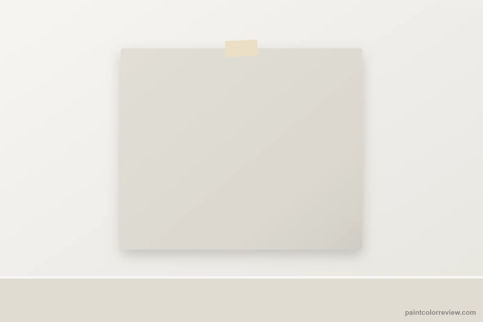
What color is Drift of Mist?
Drift of Mist (SW 9166) is a light, soft neutral that sits between a gray and a greige. It is quieter and lighter than the popular mid greiges, so walls feel airy with just a hint of color.
Drift of Mist undertones
Its warmth is gentle (yellow–blue +4.4) and it is exactly neutral on the green–red axis (0.0). That makes it one of the cleanest light neutrals Sherwin-Williams makes: no pink, purple or green to manage.
Drift of Mist LRV and light
With an LRV of 69.1, it keeps rooms bright. North light makes it a pale cool gray; south light brings out a soft warmth.
Pale cool gray
Soft warm greige
Bright morning neutral, cooler later
Gray by day, warm at sunset
Simulated from the manufacturer's color values. Always test a sample in your own light.
Best uses for Drift of Mist
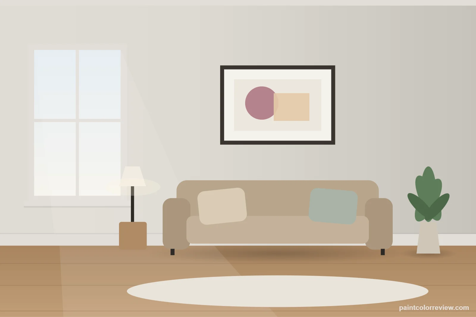
Bedrooms and bathrooms
Drift of Mist is a light, balanced greige-white (LRV 69.1) with no visible green or pink. That calm neutrality suits bedrooms and bathrooms, and it holds up under most bulbs.
Open-plan and whole-house
It reads as a soft off-white in bright rooms and a pale greige in dimmer ones, so it ties together homes with mixed warm and cool finishes.
Kitchens and cabinets
On cabinets it gives a very light greige that pairs with white counters and either brass or nickel. As a wall color it softens white cabinets without strong contrast.
Trim
Eider White, one of its coordinating colors, is a soft trim match. For crisper lines use a brighter white.
Exteriors
Sherwin-Williams lists it for exterior use; outdoors it reads close to an off-white.
When to avoid Drift of Mist
Avoid Drift of Mist if you want walls that read clearly as white or clearly as gray; it sits between them. In a dark, north-facing room it can look a little flat. If you want more color, Gossamer Veil (SW 9165), one step deeper on the same strip, gives a clearer greige.
Drift of Mist color strip
It shares a strip with Gossamer Veil, which is one step deeper (LRV 61.8), followed by darker grays down to Homburg Gray.
LRV 62Drift of Mist
LRV 69Gray Clouds
LRV 47Mineral Deposit
LRV 43Gris
LRV 39Earl Grey
LRV 32Homburg Gray
LRV 15
Drift of Mist hex code, RGB and LRV
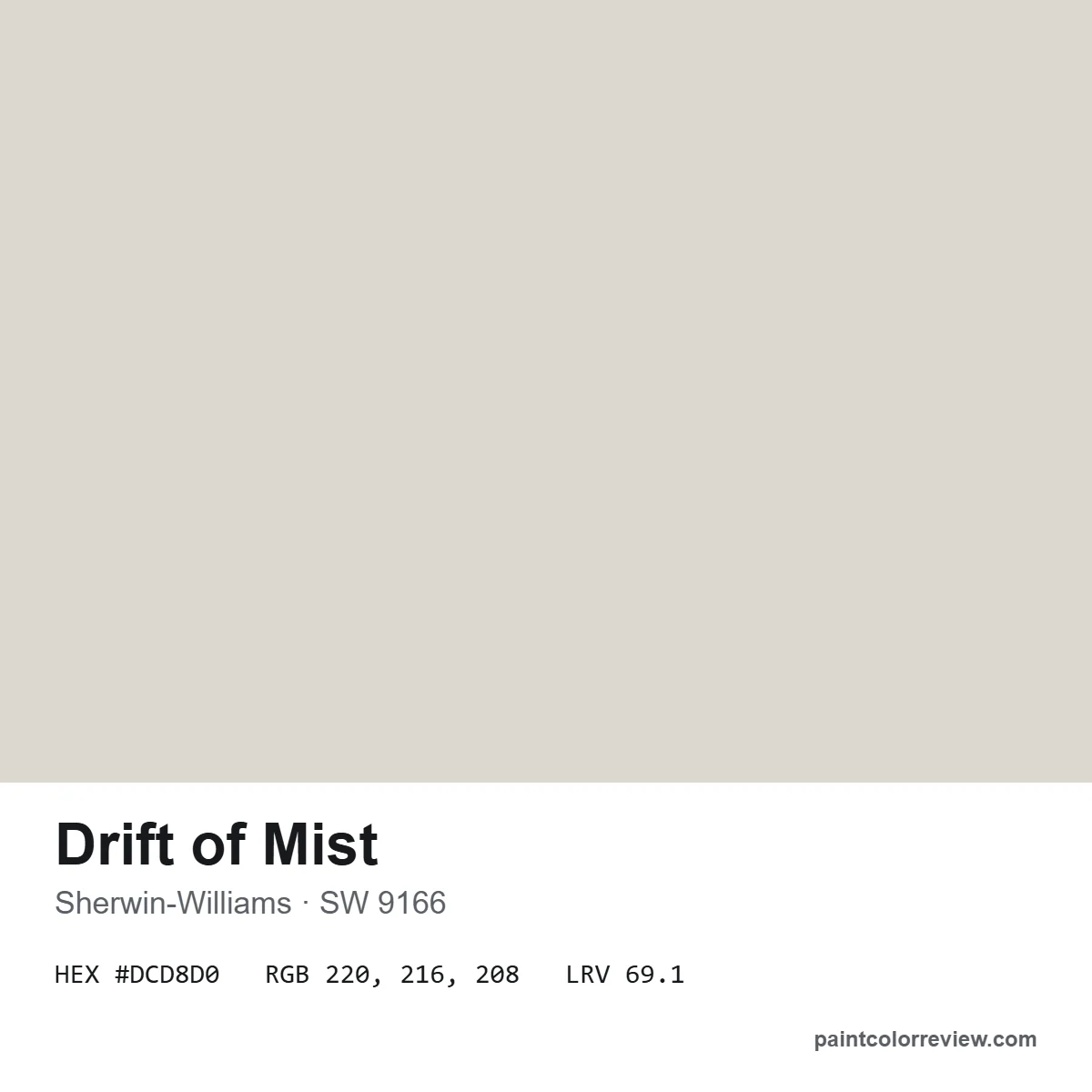
Sherwin-Williams lists Drift of Mist (SW 9166) as hex #DCD8D0, RGB 220, 216, 208 and LRV 69.14.
Drift of Mist coordinating colors
Eider White gives soft trim; Polished Concrete adds a mid-gray accent; Perle Noir, a near-black, works on doors, window frames or an island.
Drift of Mist vs Agreeable Gray and Repose Gray
Drift of Mist is the light, airy option in the same neutral family: LRV 69.1 against Agreeable Gray's 60.4 and Repose Gray's 58.2. Its warmth (+4.4) sits between the two, and unlike Repose Gray it has no green-gray lean. Choose it when you like those colors but want a lighter, brighter room.
Using its coordinating colors in a room
Sherwin-Williams' trio maps neatly onto a space: Eider White on trim and ceilings, Drift of Mist on walls, Polished Concrete on an accent wall or cabinets, and Perle Noir on a door or window frames.
Colors similar to Drift of Mist
City Loft is very close (ΔE 0.8). In Benjamin Moore, Balboa Mist is the nearest we measured (ΔE 1.1).
| Color | Brand | LRV | Difference (ΔE) | More |
|---|---|---|---|---|
| City Loft SW 7631 | Sherwin-Williams | 70.5 | 0.7 | Review |
| Windfresh White SW 7628 | Sherwin-Williams | 69.2 | 1.0 | — |
| Solstice SW 9571 | Sherwin-Williams | 69.3 | 1.0 | — |
| Balboa Mist OC-27 | Benjamin Moore | 65.5 | 1.1 | Review |
| Pale Oak OC-20 | Benjamin Moore | 68.6 | 1.4 | Review |
| Fog Mist OC-31 | Benjamin Moore | 70.2 | 2.4 | — |
ΔE is the CIEDE2000 color difference between the two manufacturer colors: around 1 is barely visible; 2–3 is visible when the chips sit side by side.
Drift of Mist FAQs
What color is Drift of Mist?
Drift of Mist (SW 9166) is a light, soft gray-greige with an LRV of 69.1.
What are the undertones of Drift of Mist?
Gently warm (yellow–blue +4.4) and exactly neutral on green–red, so no pink or green cast.
What colors go with Drift of Mist?
Sherwin-Williams pairs it with Eider White, Polished Concrete and Perle Noir.
What is the Benjamin Moore equivalent of Drift of Mist?
The closest Benjamin Moore color we measured is Balboa Mist (ΔE 1.1).
Is Drift of Mist good for cabinets?
Yes. It gives a soft, light greige that suits white counters and brass or nickel hardware.
Can Drift of Mist be used outside?
Yes. Sherwin-Williams lists it for interior and exterior use.
What is the LRV of Drift of Mist?
69.1, a light color between an off-white and a greige.