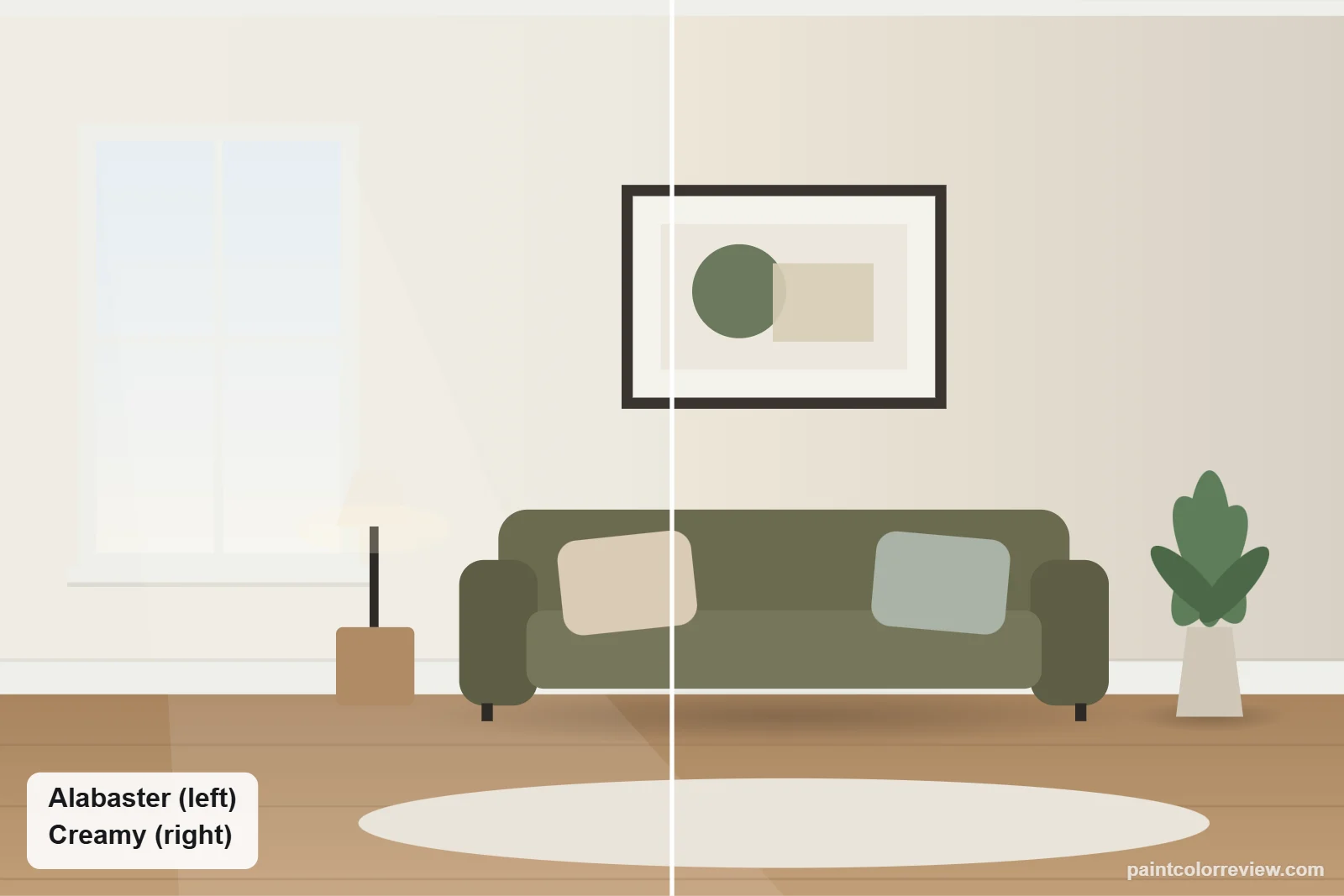
Alabaster (SW 7008) and Creamy (SW 7012) are both warm Sherwin-Williams whites, but they sit at different points on the scale: Alabaster is a soft white, Creamy a true cream.
Side-by-side numbers
| Alabaster | Creamy | |
|---|---|---|
| Brand | Sherwin-Williams | Sherwin-Williams |
| Code | SW 7008 | SW 7012 |
| Hex | #EDEAE0 | #EFE8DB |
| RGB | 237, 234, 224 | 239, 232, 219 |
| LRV | 82.2 (lighter) | 81.2 |
| Yellow–blue (b*) | +5.2 | +7.1 (warmer) |
| Green–red (a*) | −0.7 | +0.2 |
| Difference (ΔE) | 2.0 |
Hex, RGB and LRV from the manufacturers' color records. CIELAB values and ΔE (CIEDE2000) calculated from those hex values.
They are similar in brightness (LRV 82.2 vs 81.2), but the ΔE of 2.0 is visible side by side, and the difference is almost all warmth.
Undertones: Alabaster vs Creamy
Creamy is noticeably warmer: yellow–blue +7.1 against Alabaster's +5.2. Creamy is also neutral on the green–red axis (+0.2), while Alabaster leans slightly away from pink (−0.7). On the wall, Creamy reads as a soft yellow-cream; Alabaster as a warm white.
How they compare in each light
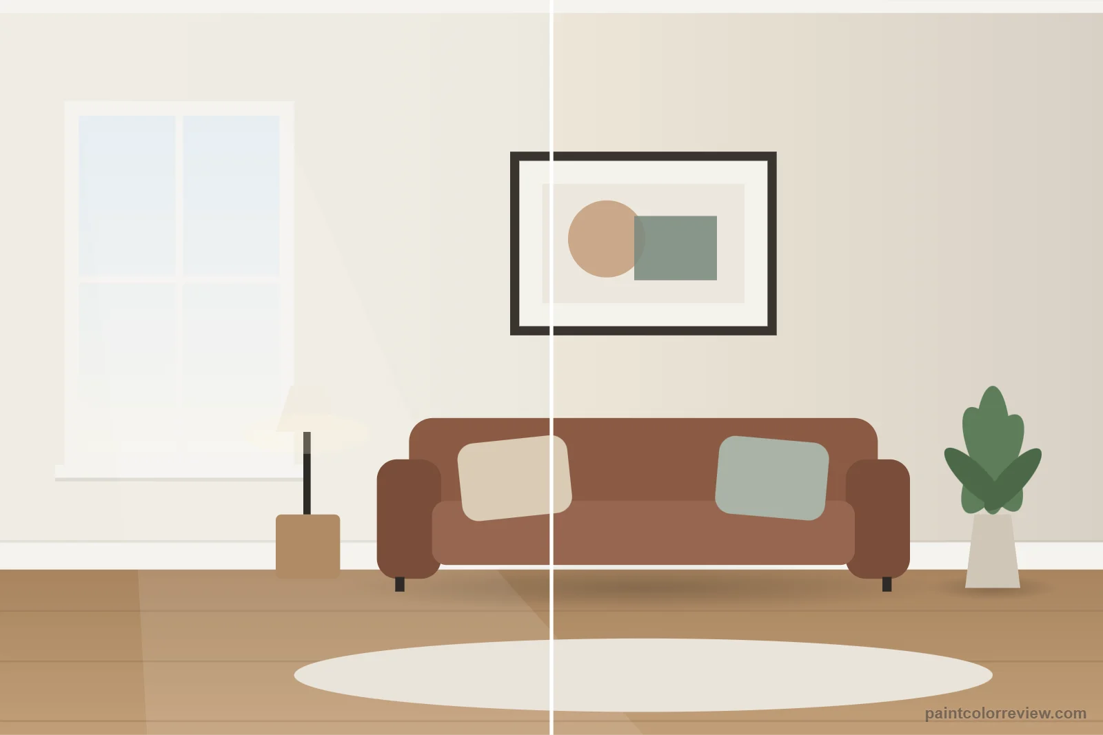
In warm south and west light Creamy can look distinctly yellow; Alabaster stays white. In cool north light Creamy holds its warmth better.
Simulated from the manufacturer's color values. Always test samples in your own light.
Which one fits your room?
Choose Alabaster if…
- You want a warm white that still reads as white
- You have mixed warm and cool finishes
- You want trim that works with many wall colors
Choose Creamy if…
- You want a clearly creamy, traditional look
- Your room is north-facing and cold
- Your finishes are warm wood, brass and cream stone
Room by room: where Alabaster and Creamy each work
Living rooms
Creamy is the warmer, more traditional choice and looks best with wood tones, cream upholstery and warm metals. Alabaster gives a cleaner warm white that sits more easily with gray or black furniture. Their LRVs are just one point apart, so brightness is not the deciding factor.
Bedrooms
In a north-facing bedroom Creamy keeps a visible warmth, which many people like; Alabaster can look a little grayer there. In a south-facing bedroom Creamy can turn noticeably yellow in the afternoon, and Alabaster stays more neutral.
Kitchens and cabinets
Alabaster is the safer cabinet white with white or gray countertops because it does not read yellow next to them. Creamy works best with warm stone, beige tile or butcher block, where its yellow becomes an asset instead of a clash.
Bathrooms
Under warm 2700K bulbs Creamy can look buttery in a small bathroom. Alabaster holds up better under the same lighting.
Exteriors
Both are rated for exterior use. In full sun Creamy reads as a soft cream, a good match for brick, stone and traditional homes; Alabaster reads as a warm white suited to modern farmhouse or contemporary exteriors.
Trim and colors to pair with each
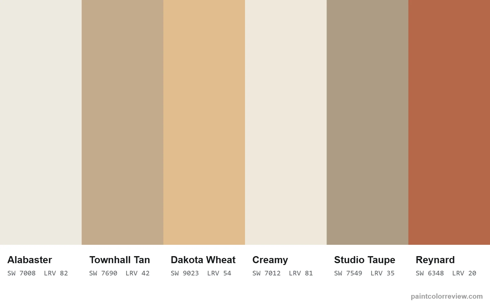
For trim, Creamy needs a white that is not cooler than it; a stark blue-white makes Creamy look yellow. Alabaster itself is a good trim for Creamy walls. Sherwin-Williams lists Studio Taupe (SW 7549) and Reynard (SW 6348) as coordinating colors for Creamy, a mid-tone taupe and a rich red-brown accent. For Alabaster it lists Townhall Tan (SW 7690) and Dakota Wheat (SW 9023).
Coordinating colors listed by the manufacturers:
- Alabaster: Townhall Tan (SW 7690), LRV 42.3; Dakota Wheat (SW 9023), LRV 54.2
- Creamy: Studio Taupe (SW 7549), LRV 34.5; Reynard (SW 6348), LRV 20.2
Can you use Alabaster and Creamy in the same house?
Yes, especially as walls and trim: Creamy walls with Alabaster trim give a soft, low-contrast look. A difference of 2.0 is visible side by side, so avoid painting them on adjoining walls of the same room unless you want a subtle shift.
If neither is quite right
If Creamy is too yellow and Alabaster not quite warm enough, try a white between them; if you want something cleaner or deeper, the table shows the nearest color in each direction.
| Direction | Color | Brand | LRV | ΔE to Alabaster | ΔE to Creamy |
|---|---|---|---|---|---|
| Lighter | Westhighland White (SW 7566) | Sherwin-Williams | 85.8 | 1.3 | 1.6 |
| Darker | Panda White (SW 6147) | Sherwin-Williams | 76.5 | 3.0 | 1.4 |
| Warmer | Restful White (SW 7563) | Sherwin-Williams | 80.6 | 2.9 | 1.9 |
| Cooler | Cloud Cover (OC-25) | Benjamin Moore | 80.3 | 1.2 | 3.1 |
Read the full reviews
Alabaster review · Creamy review
Alabaster vs Creamy FAQs
Is Creamy more yellow than Alabaster?
Yes. Creamy's yellow–blue value is +7.1 against Alabaster's +5.2.
Which is brighter?
Alabaster, very slightly (LRV 82.2 vs 81.2).
Which is better for trim?
Alabaster suits more wall colors; Creamy works with warm, traditional palettes.
Which is better for trim with Creamy walls?
Alabaster works well. It is slightly lighter and less yellow, so it reads as trim without looking stark.
Which looks better on a brick house?
Creamy, in most cases. Its warmth relates better to red and orange brick, while Alabaster can look slightly cool beside it.