What color is Alabaster?
Alabaster is a soft, warm white. It is not a bright, stark white and it is not a cream either: it sits in between, which is why it works on walls, trim and cabinets alike. Sherwin-Williams describes it as "soft, warm but balanced", and the measurements back that up.
Its yellow–blue value (b*) is +5.2, enough warmth to take the chill off a white wall. Its green–red value (a*) is −0.7, a very slight lean away from pink. In practice that means Alabaster never looks peachy; in some light it can look faintly yellow-green rather than pink, especially next to a much cooler white.
For comparison, Pure White (b* +3.0) and Extra White (b* +2.3) are both noticeably cleaner, while Creamy (b* +7.2) is clearly yellower. Alabaster sits right in the middle of the warm whites.
Alabaster LRV and how it looks in different light
Alabaster has an LRV of 82.2, so it reflects most of the light that reaches it. That is bright enough to keep a room light and open, but not so bright that it glares in a sunny room the way the very whitest whites can.
Grayer; the warmth fades and it can look dull
Warm and creamy, its most flattering light
Bright and soft in the morning, grayer later
Cool by day, golden at sunset
Simulated from the manufacturer's color values. Always test a sample in your own light.
The weak spot is north light. Cool, indirect light pulls the warmth out of Alabaster and it can read slightly gray or flat. If your room faces north and you want it to look clean rather than dingy, test it beside a brighter, cleaner white such as Pure White.
Best uses for Alabaster
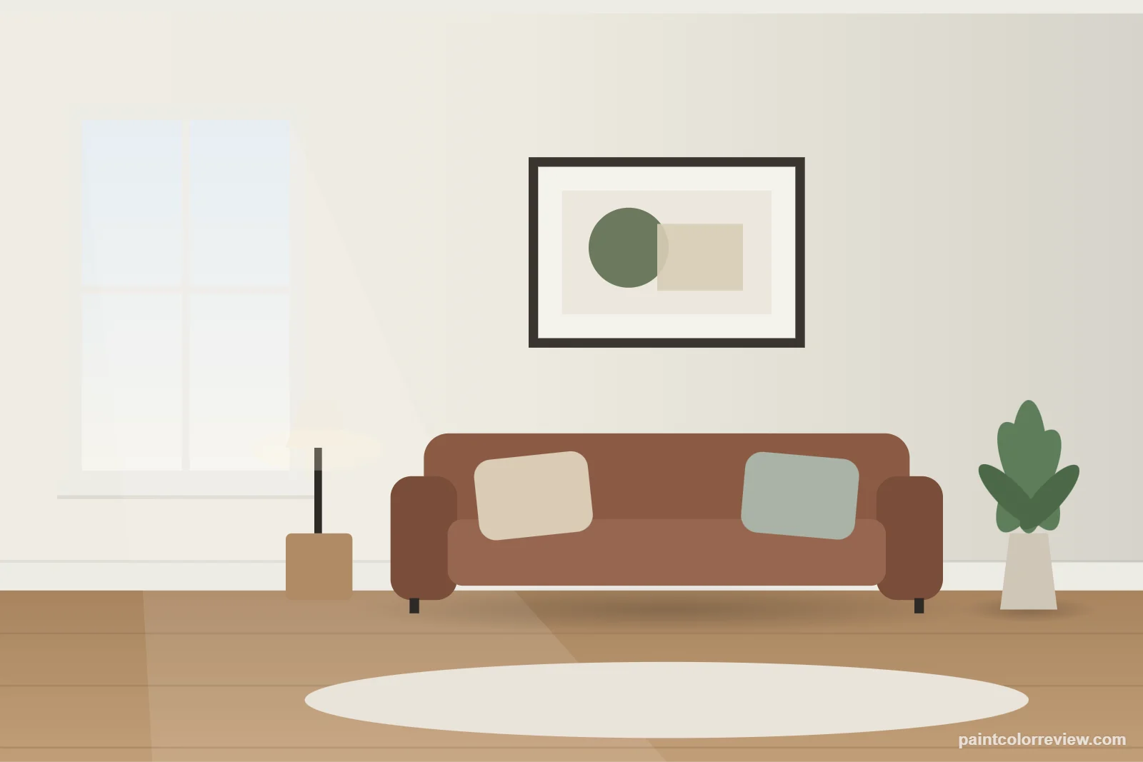
Walls
Alabaster is one of the easiest whites to live with on walls. It is warm enough to feel welcoming with wood floors and soft lighting, and light enough to make small rooms feel bigger.
Kitchen cabinets
On cabinets it gives a soft white that looks less clinical than a pure white and hides yellowing better as finishes age. It pairs especially well with warm wood floors, brass hardware and white or cream countertops. Next to very cool marble, test it first: the contrast can make the cabinets look more yellow than you expect.
Trim and ceilings
As trim, Alabaster suits warm wall colors. With cool grays it can look a little yellow by comparison, so a cleaner white is usually the better trim choice there.
Alabaster walls with Pure White trim
This is a popular combination, and it works because the two whites are close but not identical (ΔE 1.9). Pure White is slightly brighter and cleaner, so the trim reads crisp without the strong contrast of a bright white against a cream.
Exteriors
Sherwin-Williams lists Alabaster for exterior use, and it is a common choice for siding and trim. Strong sun makes any white look brighter, so outside Alabaster reads as a clean, warm white rather than a cream. Against black windows or a dark roof, the warmth keeps it from looking harsh.
When to avoid Alabaster
Skip Alabaster if you want a crisp, gallery-style white: with a yellow–blue value of +5.2 it will always look soft and slightly warm. It is also a weak match for rooms built around cool materials, such as blue-white quartz, gray-veined marble, chrome and cool gray tile, where it can look creamy or even dingy by comparison. In those rooms a cleaner white such as Pure White (SW 7005) or Extra White is the safer choice.
Alabaster color strip
Alabaster shares its Sherwin-Williams strip with other soft whites and light neutrals. Pure White and Westhighland White are the brighter whites beside it; Egret White and the colors after it step down into light greige and gray.
LRV 84Alabaster
LRV 82Westhighland White
LRV 86Egret White
LRV 70Pediment
LRV 61Crushed Ice
LRV 66On the Rocks
LRV 62
Alabaster hex code, RGB and LRV
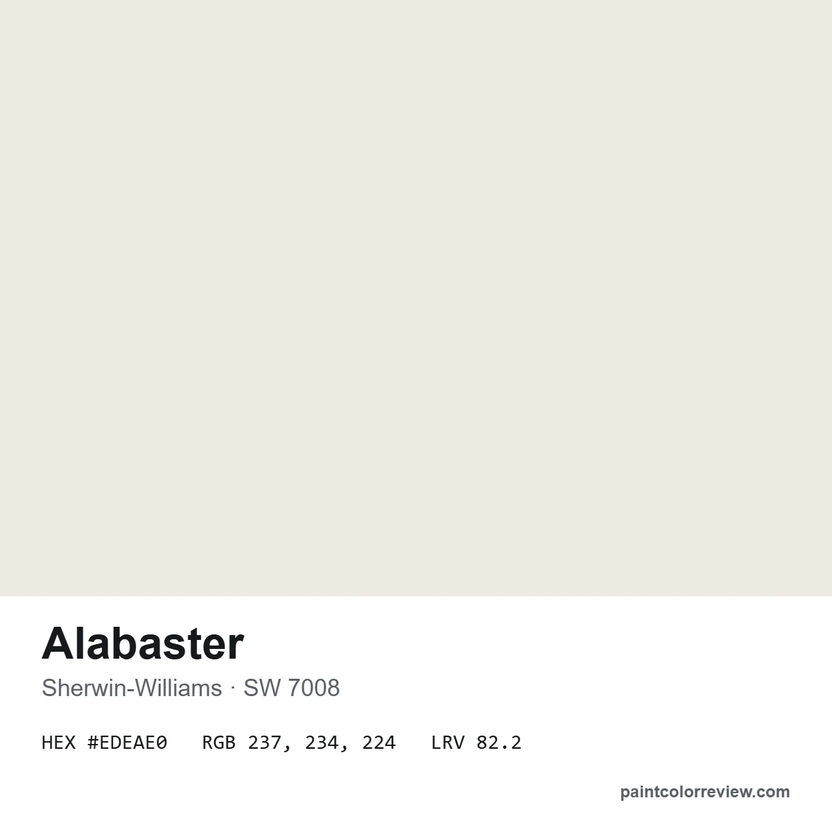
Sherwin-Williams lists Alabaster (SW 7008) as hex #EDEAE0, RGB 237, 234, 224 and LRV 82.215. The hex value is useful for mood boards and digital mockups, but screens shift color, so check a physical sample before you buy.
Colors that go with Alabaster
Sherwin-Williams' coordinating colors for Alabaster are two warm earth tones:
Beyond those, Alabaster makes an easy trim and ceiling color for warm greiges. It is a natural partner for Agreeable Gray walls, where it keeps the whole room soft and warm. For contrast, it also looks good with deep greens, navy and charcoal, which make the white look brighter.
Colors similar to Alabaster
Alabaster has some very close relatives. Cotton (SW 9581) is almost identical, with a ΔE of only 0.2. In Benjamin Moore, the closest colors we measured are Swiss Coffee and White Dove.
| Color | Brand | LRV | Difference (ΔE) | More |
|---|---|---|---|---|
| Cotton SW 9581 | Sherwin-Williams | 83.1 | 0.2 | — |
| Cold Foam SW 9504 | Sherwin-Williams | 84.0 | 0.6 | — |
| Greek Villa SW 7551 | Sherwin-Williams | 84.2 | 0.7 | Comparison |
| Swiss Coffee OC-45 | Benjamin Moore | 81.9 | 0.8 | Review |
| Dove Wing OC-18 | Benjamin Moore | 77.5 | 1.0 | — |
| White Dove OC-17 | Benjamin Moore | 83.2 | 1.2 | Review |
ΔE is the CIEDE2000 color difference between the two manufacturer colors: around 1 is barely visible; 2–3 is visible when the chips sit side by side.
The three Sherwin-Williams comparisons people ask about most: Alabaster vs Greek Villa (very close, Greek Villa slightly brighter), Alabaster vs Creamy (Creamy is clearly warmer and yellower) and Alabaster vs Shoji White (Shoji White is darker and more beige).
Before you paint
- Test it next to your other whites. Whites change most when they sit beside each other; compare Alabaster with your trim, tile and countertops.
- Check it in your darkest room. If it looks flat there, consider a cleaner white for that room only.
- Use a large sample. Small chips make every white look the same.
Alabaster FAQs
What color is Sherwin-Williams Alabaster?
A soft, warm white (SW 7008). It sits between a bright white and a cream, with a gentle warmth that keeps it from looking stark.
What are the undertones of Alabaster?
Warm. Its yellow–blue value is +5.2, and its green–red value is −0.7, a very slight lean away from pink. It can look faintly yellow-green beside cooler whites, never peachy.
What is the LRV of Alabaster?
82.215, according to Sherwin-Williams, usually rounded to 82.
What is the hex code for Alabaster SW 7008?
#EDEAE0, which is RGB 237, 234, 224.
Is Alabaster good for kitchen cabinets?
Yes. It gives a soft white that looks warmer and less clinical than a pure white, and suits wood floors and brass hardware. Test it beside cool marble, which can make it look more yellow.
Can you use Alabaster on exteriors?
Yes. Sherwin-Williams lists it for exterior use. In direct sun it reads as a clean, warm white.
What trim color goes with Alabaster walls?
Pure White (SW 7005) is a popular choice: slightly brighter and cleaner, so the trim looks crisp without strong contrast. Alabaster itself also works as an all-over color on walls and trim.
What is the Benjamin Moore equivalent of Alabaster?
There is no exact equivalent. The closest Benjamin Moore colors we measured are Swiss Coffee (OC-45) and White Dove (OC-17).