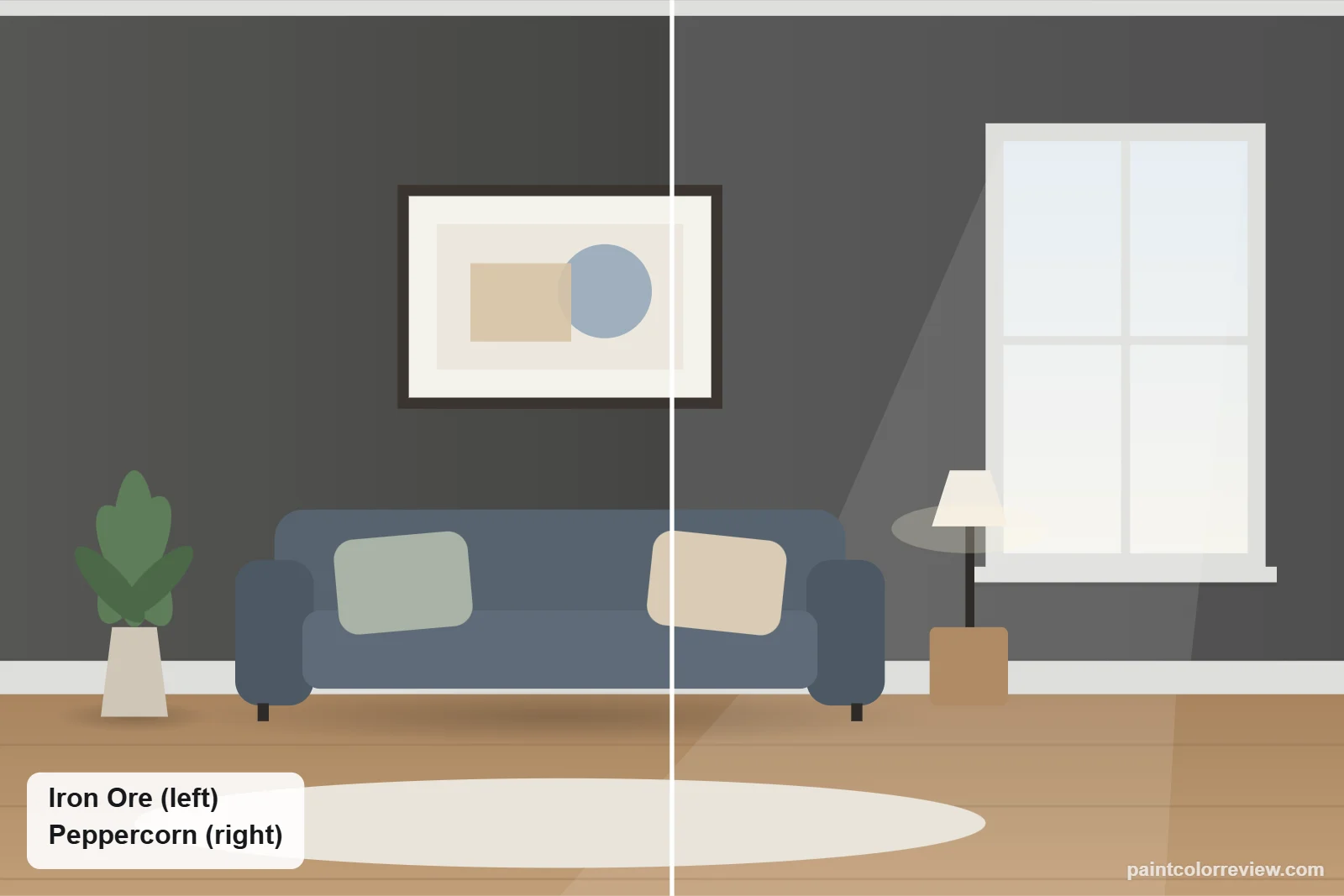
Iron Ore (SW 7069) and Peppercorn (SW 7674) are both dark, neutral Sherwin-Williams grays, and both are popular on exteriors and cabinets. The real question is how dark you want to go: one reads as black, the other as charcoal.
Side-by-side numbers
| Iron Ore | Peppercorn | |
|---|---|---|
| Brand | Sherwin-Williams | Sherwin-Williams |
| Code | SW 7069 | SW 7674 |
| Hex | #434341 | #585858 |
| RGB | 67, 67, 65 | 88, 88, 88 |
| LRV | 5.5 | 9.7 (lighter) |
| Yellow–blue (b*) | +1.2 (warmer) | −0.0 |
| Green–red (a*) | −0.4 | +0.0 |
| Difference (ΔE) | 7.4 |
Hex, RGB and LRV from the manufacturers' color records. CIELAB values and ΔE (CIEDE2000) calculated from those hex values.
Iron Ore is much darker (LRV 5.5 vs 9.7; our LRV guide explains the scale). The measured difference is 7.4, so on a wall they look like clearly different colors.
Is Peppercorn or Iron Ore darker?
Iron Ore is darker. It reflects 5.5% of light against Peppercorn’s 9.7%, so Peppercorn bounces back almost twice as much. That gap matters more than undertone here: if your room is small or shaded, Peppercorn keeps it from going black; if you want drama, Iron Ore delivers it.
Undertones: Iron Ore vs Peppercorn
Both are close to neutral. Peppercorn measures exactly 0.0 on both undertone scales; Iron Ore has a faint warmth (+1.2) and a whisper of green (−0.4). In practice the difference you see is depth, not undertone.
How they compare in each light
North light makes Iron Ore read black and Peppercorn a deep charcoal. In sun Iron Ore becomes a soft charcoal and Peppercorn a mid-dark gray. Peppercorn keeps more visible detail in dim rooms.
Simulated from the manufacturer's color values. Always test samples in your own light.
Which one fits your room?
Choose Iron Ore if…
- You want the drama of near-black
- You want maximum contrast with white trim
- The space gets plenty of light
Choose Peppercorn if…
- You want a dark color that clearly reads as gray
- The room or facade gets less direct light
- You want a more forgiving dark on large areas like siding
Where each one works
Exteriors
Peppercorn on siding reads as a classic dark gray house; Iron Ore reads as a modern soft-black house. A common tonal scheme is Peppercorn siding with Iron Ore window frames and doors. Check vinyl guidance before using dark colors.
Kitchen cabinets and islands
Iron Ore makes cabinets look graphic and bold; Peppercorn shows the profile of shaker doors and moldings more, because it is lighter.
Accent walls and media rooms
Iron Ore gives a near-black, cinema-like wall. Peppercorn is the better choice when the room has only moderate light.
Bathroom vanities and built-ins
Both work; Peppercorn looks more like a tailored charcoal, Iron Ore more like painted black.
Black windows, hardware and fixtures
With black window frames, Iron Ore blends in and the windows almost disappear into the facade, while Peppercorn lets black frames stand out as a crisp outline. Indoors, matte black hardware vanishes on Iron Ore cabinets but reads clearly on Peppercorn; brass and brushed nickel show up well on both. Stainless appliances look more integrated beside Peppercorn, because the two are closer in value.
Trim and colors to pair with each
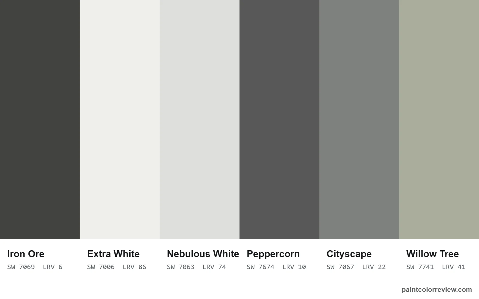
Nebulous White is a coordinating color for both, which makes it an easy shared trim. Iron Ore is also listed with Extra White and Cityscape; Peppercorn with Windfresh White and the soft green-gray Willow Tree.
Using Iron Ore and Peppercorn together
Because both are nearly neutral and 7.4 apart in depth, they make an easy tonal pair. Peppercorn on the body of the house with Iron Ore on doors, window frames and garage doors is the classic version; indoors, Peppercorn lower cabinets with an Iron Ore island works the same way. Nebulous White, a coordinating color for both, ties the scheme together on trim.
If neither is quite right
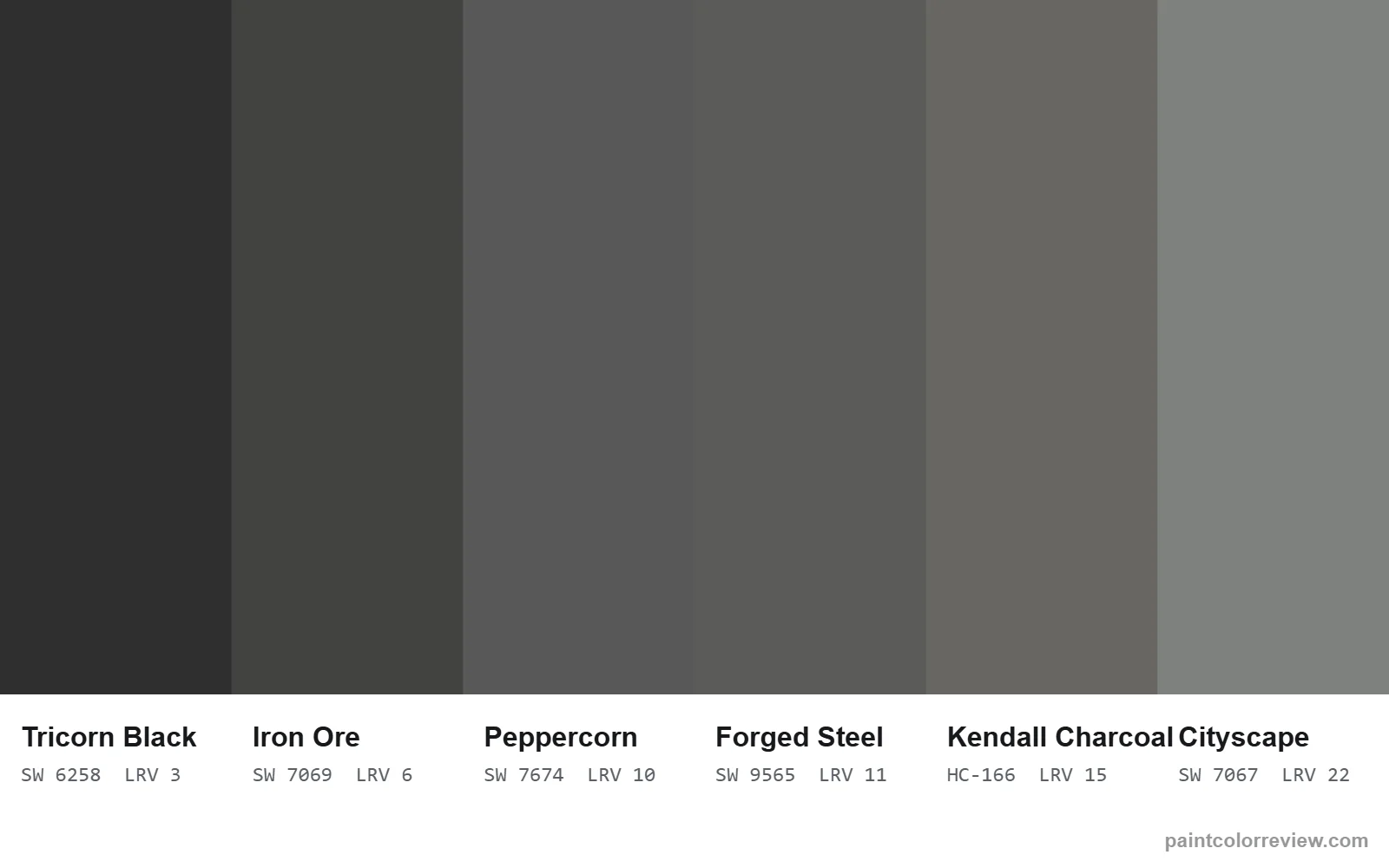
For a lighter charcoal still, Kendall Charcoal (LRV 14.61). For a warmer dark, Urbane Bronze. For a true black, Tricorn Black (SW 6258). For a near-twin of Peppercorn, Forged Steel (SW 9565) is only 1.6 apart.
Read the full reviews
Iron Ore review · Peppercorn review · Iron Ore vs Urbane Bronze
Iron Ore vs Peppercorn FAQs
Is Peppercorn or Iron Ore darker?
Iron Ore. Its LRV is 5.5 against Peppercorn’s 9.7, and the two are 7.4 apart, so the difference is easy to see on a wall.
Which is more neutral, Iron Ore or Peppercorn?
Peppercorn, which measures 0.0 on both undertone scales. Iron Ore is close behind, with a faint warmth (+1.2).
Does Peppercorn look blue next to Iron Ore?
It can look slightly cooler beside warm materials, but next to Iron Ore the two look like light and dark versions of the same neutral.
Which is better for exterior siding?
Peppercorn is the more forgiving body color and reads as a classic dark gray. Iron Ore suits siding on modern homes with strong light, or works best on doors and trim.
Can I use Iron Ore and Peppercorn together?
Yes. Peppercorn siding with Iron Ore doors and windows, or Peppercorn cabinets with an Iron Ore island, are easy tonal pairings. Nebulous White trim suits both.
Which is better for kitchen cabinets?
Iron Ore for a bold, near-black look; Peppercorn if you want the door profiles and moldings to show and stainless appliances to blend in.
Which goes better with black windows?
Iron Ore if you want the frames to blend in; Peppercorn if you want them to stand out as a crisp outline.