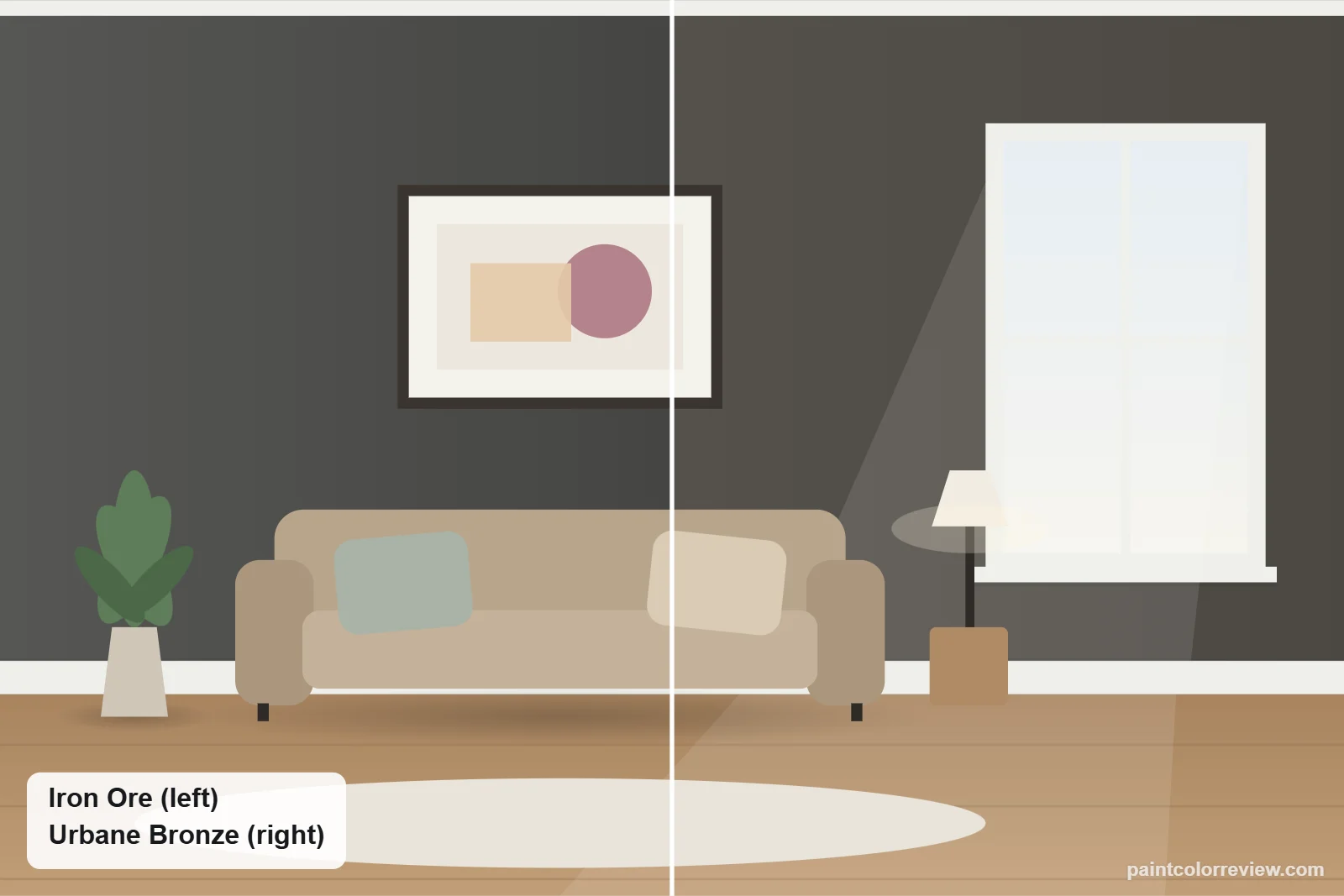
Iron Ore (SW 7069) and Urbane Bronze (SW 7048) are two of Sherwin-Williams' most popular dark neutrals, and both are used on exteriors, doors and cabinets. They are not interchangeable: one is a cool soft black, the other a warm bronze-gray.
Side-by-side numbers
| Iron Ore | Urbane Bronze | |
|---|---|---|
| Brand | Sherwin-Williams | Sherwin-Williams |
| Code | SW 7069 | SW 7048 |
| Hex | #434341 | #54504A |
| RGB | 67, 67, 65 | 84, 80, 74 |
| LRV | 5.5 | 8.1 (lighter) |
| Yellow–blue (b*) | +1.2 | +4.1 (warmer) |
| Green–red (a*) | −0.4 | +0.4 |
| Difference (ΔE) | 5.4 |
Hex, RGB and LRV from the manufacturers' color records. CIELAB values and ΔE (CIEDE2000) calculated from those hex values.
Iron Ore is darker (LRV 5.5 vs 8.1) and the measured difference between them is 5.4, large enough that nobody will mistake one for the other on a wall.
Undertones: Iron Ore vs Urbane Bronze
Iron Ore is close to neutral (see our undertone guide for how these numbers work; yellow–blue +1.2, green–red −0.4) and reads as charcoal. Urbane Bronze is clearly warmer (+4.1) with a touch of red (+0.4), which gives it its bronze, brown-gray look.
How they compare in each light
In north light Iron Ore reads as black and Urbane Bronze as a deep charcoal. In sun, Iron Ore opens to a soft charcoal while Urbane Bronze shows its warm brown. Warm bulbs widen the gap: Urbane Bronze looks warmer, Iron Ore stays neutral.
Simulated from the manufacturer's color values. Always test samples in your own light.
Which one fits your room?
Choose Iron Ore if…
- You want a near-black that reads crisp and modern
- Your exterior has cool stone, concrete or white siding
- You want maximum contrast with white trim
Choose Urbane Bronze if…
- You want warmth: wood, brick, brass or cream
- You want a softer dark that does not read as black
- Your room or exterior gets less direct light
Where each one works
Exteriors
Both are listed by Sherwin-Williams for exterior use. Iron Ore suits modern and farmhouse homes with white trim, black windows and concrete or cool stone. Urbane Bronze suits homes with cedar, warm stone or brick, where its brown undertone ties in. Check vinyl siding guidance before going dark with either.
Front doors
On a white or gray house, an Iron Ore door reads as a soft black. On a cream, tan or brick house, Urbane Bronze looks more natural.
Kitchen cabinets and islands
Iron Ore gives a sharper, more graphic look with white quartz and nickel; Urbane Bronze is warmer with butcher block, cream counters and brass.
Accent walls and dens
Iron Ore makes a dramatic, almost black wall; Urbane Bronze feels cozier and more forgiving in rooms with less light, thanks to its higher LRV.
Iron Ore vs Urbane Bronze on different home styles
Modern homes
Iron Ore is the stronger pick on flat, minimal facades with concrete, glass and steel, because it reads as a deliberate soft black. Urbane Bronze suits warm-modern designs with cedar cladding and natural stone.
Modern farmhouses
For the classic white-siding, dark-window farmhouse, Iron Ore on doors, shutters and window trim gives the familiar crisp contrast. Urbane Bronze on the whole house, with cream trim and wood posts, gives a softer, earthier farmhouse.
Traditional homes
On colonials and Cape Cods, both work best as accents. Iron Ore suits white or gray siding; Urbane Bronze suits cream, tan and red brick.
Craftsman and mountain homes
Urbane Bronze usually wins here: its bronze-brown sits naturally with stone bases, stained timber and trees. Iron Ore can look stark on a wooded lot.
Trim and colors to pair with each
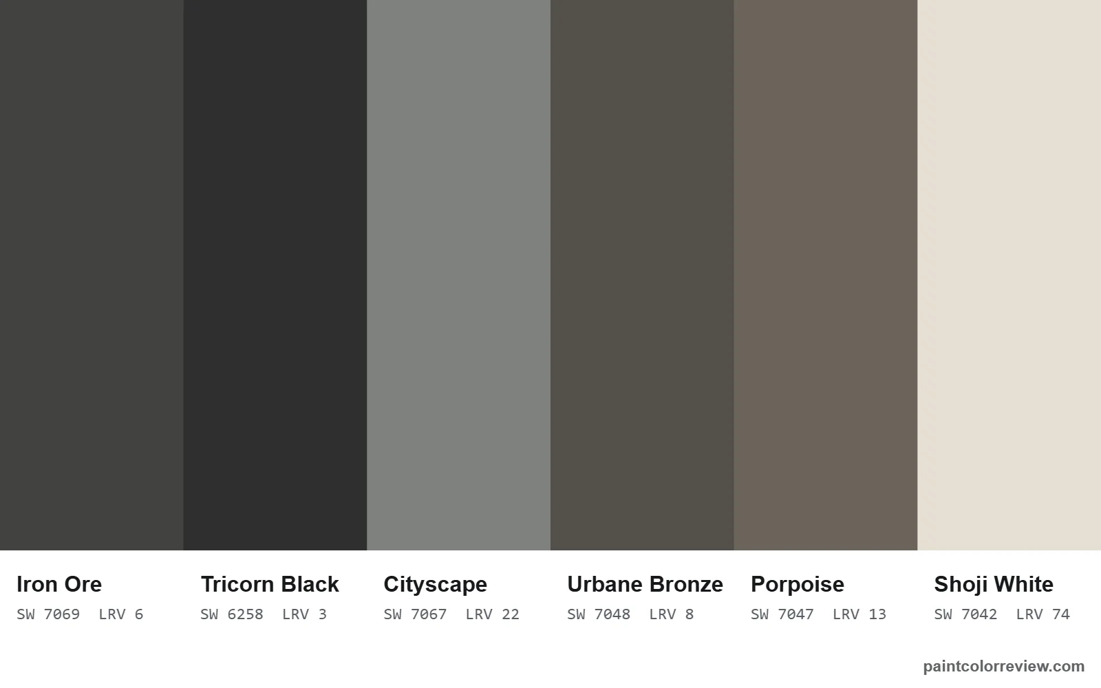
Sherwin-Williams lists Extra White as a coordinating color for both, so Extra White works as a shared trim if you use them on the same house. Iron Ore's other coordinating colors are Nebulous White and Cityscape; Urbane Bronze's are Shoji White and the warm cream Ivoire.
Using Iron Ore and Urbane Bronze together
They are 5.4 apart, different enough to read as two colors but close enough in depth to sit together. The pairing works best when each has a clear job: Urbane Bronze on siding or walls, Iron Ore on window frames, railings and the front door as the darker accent. Use Extra White trim, a coordinating color for both, to tie them together. Avoid putting them side by side on large flat areas, where the warm and cool contrast can look like a mismatch.
If neither is quite right
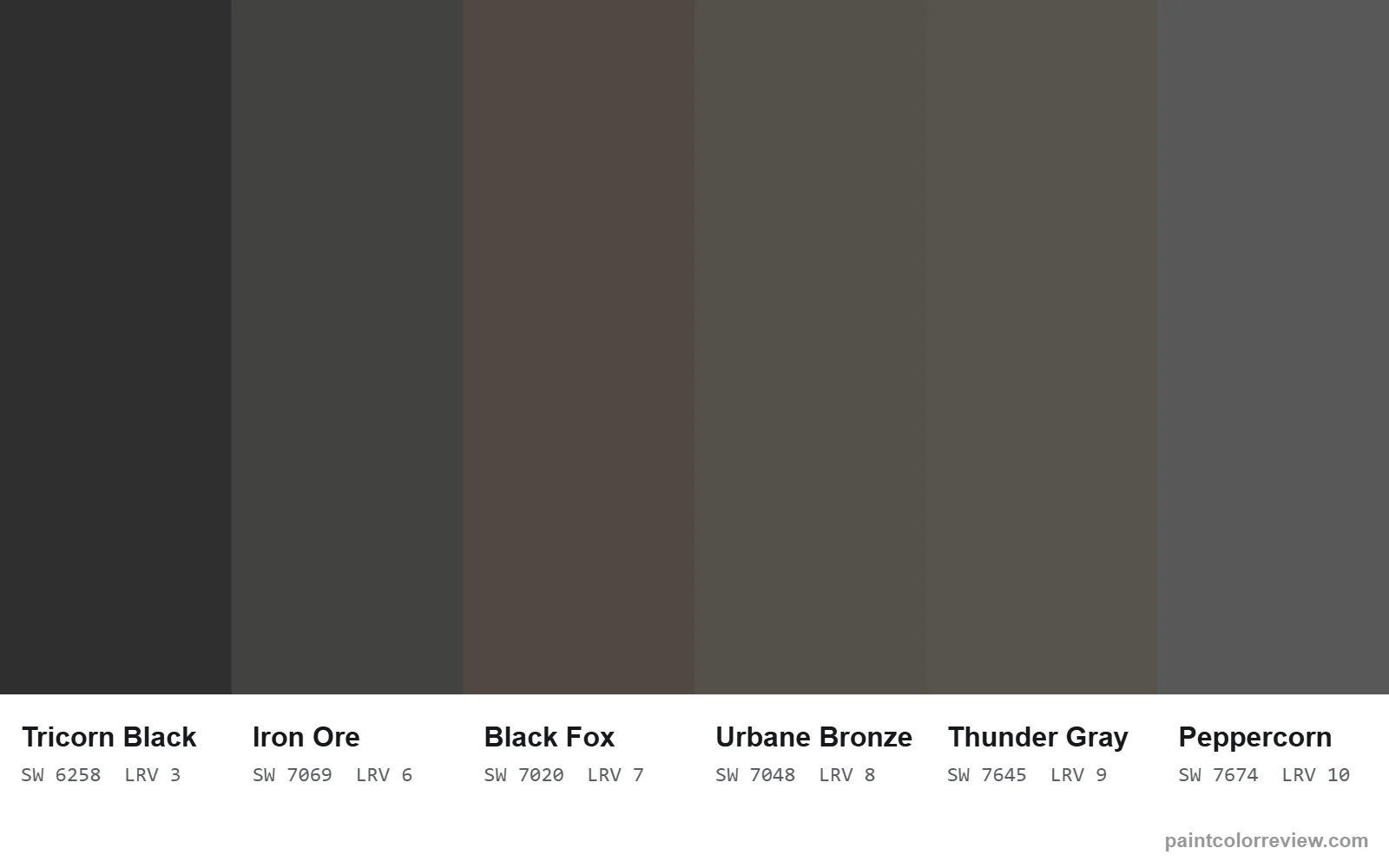
For something darker and truly black, Tricorn Black (SW 6258). For a warmer, browner soft black, Black Fox. For a lighter, perfectly neutral charcoal, Peppercorn. For a near-twin of Urbane Bronze, Thunder Gray (SW 7645) is only 1.2 apart.
Read the full reviews
Iron Ore review · Urbane Bronze review · Iron Ore vs Peppercorn
Iron Ore vs Urbane Bronze FAQs
Iron Ore or Urbane Bronze: which should I choose?
Choose Iron Ore for a near-neutral soft black that suits modern, cool or white-trimmed homes. Choose Urbane Bronze for a warmer bronze-gray that suits wood, brick, stone and cream.
Is Iron Ore darker than Urbane Bronze?
Yes. Iron Ore has an LRV of 5.5 and Urbane Bronze 8.1, so Iron Ore reflects less light and reads closer to black.
Which is warmer, Iron Ore or Urbane Bronze?
Urbane Bronze. Its yellow–blue value is +4.1 against Iron Ore’s +1.2, which gives it a visible brown-bronze cast.
Which is better for exteriors?
Both are rated for exterior use. Iron Ore suits modern and farmhouse homes with white trim; Urbane Bronze suits craftsman, mountain and brick homes. Both look lighter in full sun.
Which goes better with black windows?
Iron Ore, because its neutral charcoal sits close to black frames. Urbane Bronze can make black windows look harsher by contrast, though bronze or dark brown frames suit it.
Can you use Iron Ore and Urbane Bronze together?
Yes, if each has a clear role, such as Urbane Bronze siding with Iron Ore doors and windows. Extra White trim works with both.
Which is better for a front door?
Iron Ore on white or gray houses; Urbane Bronze on cream, tan or brick houses.
Which is better for kitchen cabinets?
Iron Ore looks sharper with white quartz and nickel; Urbane Bronze looks warmer with wood, cream counters and brass.