Paint undertones explained: how to spot and choose them
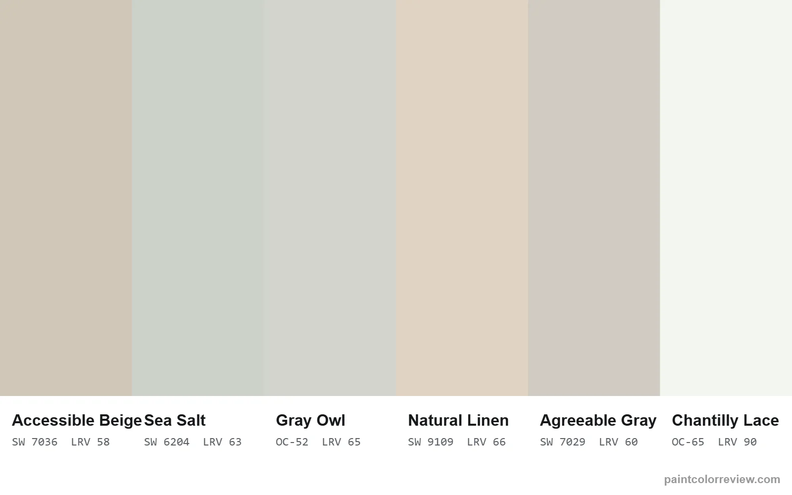
A paint undertone is the subtle hue beneath a color's main color, such as yellow, green, blue or pink. It decides how the color looks on your walls and next to your floors and counters. You spot it by comparing chips side by side against pure white, and by testing in your own light.
What is a paint undertone?
Every paint color has a main color, what you'd name it at a glance (white, gray, beige), and an undertone: the subtle hue underneath that decides how it behaves on the wall. Two grays can look identical on a small chip and completely different on a wall, because one leans green and the other leans beige.
Undertones are why a "gray" can look blue in one room and beige in another, and why a white can look crisp next to one countertop and yellow next to another.
The common undertones in neutral paint
Yellow or beige (warm). Common in whites and greiges. It makes rooms feel cozy, but can look yellow next to cleaner whites. Example: Accessible Beige.
Green. Shows up in many grays and soft whites, often as a "sage" or stony cast. Example: Sea Salt, a clear green-gray.
Blue (cool). Makes grays look crisp and modern, and sometimes cold in north light.
Pink, red or violet. Gives beiges and taupes a rosy or peachy look, especially under warm bulbs. Example: Natural Linen has a small warm-red lean.
How we measure undertones
Instead of guessing from a screen, we convert each color's official hex value to CIELAB, a color space built around how people see color. Two of its numbers describe undertone directly:
- b* (yellow–blue): positive means warm/yellow, negative means cool/blue. Most popular whites and greiges sit between +2 and +9.
- a* (green–red): negative means a green lean, positive means a pink or red lean. Values within about ±1 are close to neutral.
The meters above show Sea Salt: a strong green lean (a* −3.2) with slight warmth. Every color review on this site shows the same two meters, so you can compare undertones like for like.
How to spot undertones yourself
- Compare against a pure white. Hold the chip on plain white printer paper; the undertone shows up against a neutral background.
- Compare colors side by side. Undertones are relative. Put two similar chips together and the difference jumps out.
- Look at the darkest color on the strip. The deepest shade on a manufacturer's strip often reveals the family's undertone more clearly than the light shade you'll paint.
- Check it in your own light. Paint a large sample board and look at it morning, midday and evening.
Why light changes undertones
North-facing light is cool and indirect, so it brings out green and blue undertones and mutes warmth. South- and west-facing light is warm, so yellow, beige and pink undertones show more. Bulbs matter too: warm (2700K) bulbs push colors warmer, cool daylight bulbs push them cooler. That is why every review here shows simulated north, south, east and west previews.
Undertones and your fixed finishes
Choose undertones that agree with what you can't change: floors, counters, tile and fixtures. Warm woods and brass suit warm and beige undertones; cool marble, chrome and white tile suit cleaner and cooler ones. Clashing undertones are the most common reason a well-reviewed color looks "wrong" in a particular room. For lightness, read our LRV guide; for a full method, see how to choose a paint color.
Undertones of popular colors, measured
Here is how 18 well-known colors compare on the two undertone scales. The further a color sits from the center line, the stronger its green or pink lean; the higher it sits, the warmer it looks.
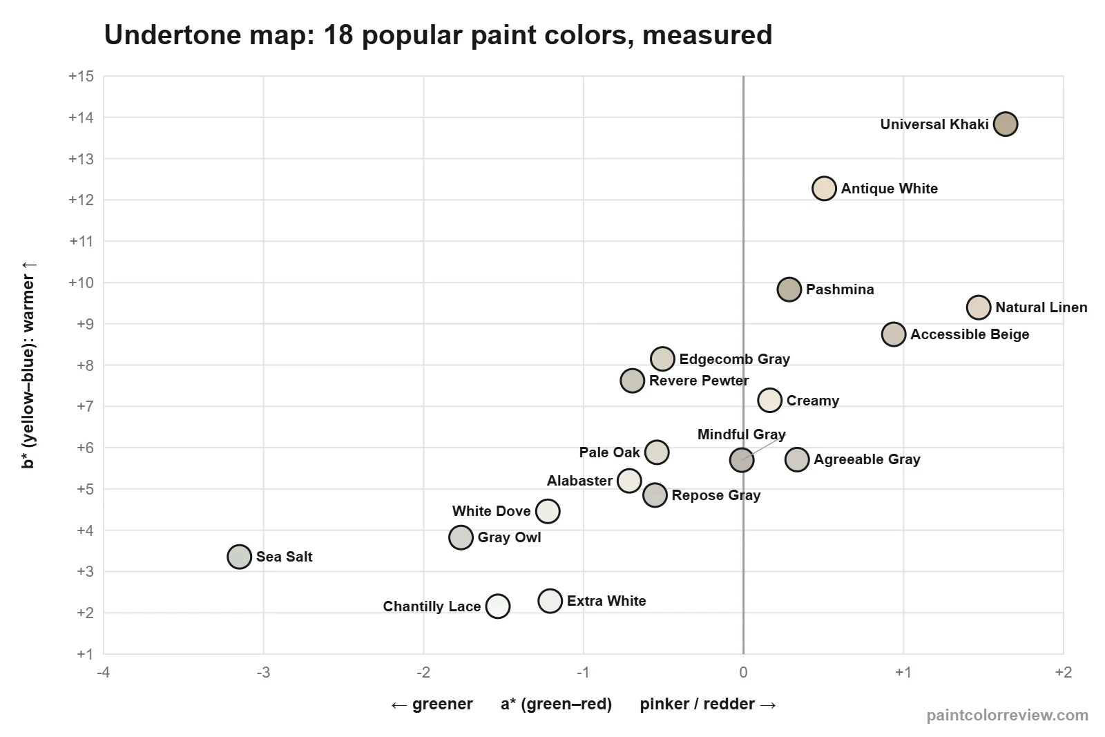
The full measured list for every color we have reviewed is below, grouped by family. Use it to shortlist colors with the undertone you want before buying samples.
| Color | Family | Yellow–blue (b*) | Green–red (a*) | Reads as |
|---|---|---|---|---|
| Sea Salt (SW 6204) | Green | +3.4 | -3.2 | gently warm, clearly green |
| Drift of Mist (SW 9166) | Neutral | +4.4 | -0.0 | gently warm, neutral |
| Gossamer Veil (SW 9165) | Neutral | +5.6 | -0.0 | gently warm, neutral |
| Agreeable Gray (SW 7029) | Neutral | +5.7 | +0.3 | gently warm, neutral |
| Repose Gray (SW 7015) | Neutral | +4.8 | -0.6 | gently warm, slightly green |
| Accessible Beige (SW 7036) | Neutral | +8.7 | +0.9 | warm, slightly warm-red |
| Revere Pewter (HC-172) | Neutral | +7.6 | -0.7 | warm, slightly green |
| Mindful Gray (SW 7016) | Neutral | +5.7 | -0.0 | gently warm, neutral |
| Pashmina (AF-100) | Neutral | +9.8 | +0.3 | very warm, neutral |
| Universal Khaki (SW 6150) | Neutral | +13.8 | +1.6 | very warm, warm-red |
| Chantilly Lace (OC-65) | White | +2.2 | -1.5 | clean / cool-neutral, clearly green |
| Simply White (OC-117) | White | +4.3 | -1.6 | gently warm, clearly green |
| Extra White (SW 7006) | White | +2.3 | -1.2 | clean / cool-neutral, slightly green |
| Cloud White (OC-130) | White | +5.4 | -1.6 | gently warm, clearly green |
| Greek Villa (SW 7551) | White | +5.3 | -0.4 | gently warm, neutral |
| Pure White (SW 7005) | White | +3.0 | -0.7 | gently warm, slightly green |
| White Dove (OC-17) | White | +4.5 | -1.2 | gently warm, slightly green |
| Snowbound (SW 7004) | White | +2.8 | +0.1 | clean / cool-neutral, neutral |
| Dover White (SW 6385) | White | +7.5 | -0.3 | warm, neutral |
| Alabaster (SW 7008) | White | +5.2 | -0.7 | gently warm, slightly green |
| Swiss Coffee (OC-45) | White | +5.6 | -1.2 | gently warm, slightly green |
| Creamy (SW 7012) | White | +7.1 | +0.2 | warm, neutral |
| Pearly White (SW 7009) | White | +5.5 | -0.0 | gently warm, neutral |
| Shoji White (SW 7042) | White | +6.7 | +0.3 | warm, neutral |
| Aesthetic White (SW 7035) | White | +5.6 | +0.3 | gently warm, neutral |
| Antique White (SW 6119) | White | +12.3 | +0.5 | very warm, slightly warm-red |
| City Loft (SW 7631) | White | +5.0 | +0.1 | gently warm, neutral |
| Egret White (SW 7570) | White | +5.6 | +0.3 | gently warm, neutral |
| Pale Oak (OC-20) | White | +5.9 | -0.5 | gently warm, slightly green |
| Balboa Mist (OC-27) | White | +5.4 | -0.4 | gently warm, neutral |
| Natural Cream (OC-14) | White | +8.0 | -0.9 | warm, slightly green |
| Gray Owl (OC-52) | White | +3.8 | -1.8 | gently warm, clearly green |
| Edgecomb Gray (HC-173) | White | +8.1 | -0.5 | warm, slightly green |
| Natural Linen (SW 9109) | Yellow | +9.4 | +1.5 | very warm, warm-red |
Common undertone problems and how to fix them
"My gray looks blue"
Cool light (north-facing windows, cool-white bulbs) pulls grays toward blue. Choose a gray with more warmth, a yellow–blue value of about +5 or more, such as Agreeable Gray (+5.7) instead of Repose Gray (+4.8), or switch to 2700–3000K bulbs.
"My greige looks green"
Greiges with a negative green–red value show green next to cool finishes and in north light. Revere Pewter (−0.7) and Natural Cream (−0.9) are examples. Move to a greige at or just above zero, such as Agreeable Gray (+0.3) or Gossamer Veil (0.0).
"My beige looks pink or peachy"
Beiges with a positive green–red value pick up pink under warm bulbs and evening light. Accessible Beige (+0.9) and Natural Linen (+1.5) lean that way. If that bothers you, choose a beige or greige with a value at or below zero, such as Edgecomb Gray (−0.5).
"My white looks yellow"
Whites with a high yellow–blue value look yellow next to cleaner whites, white quartz and white appliances. Dover White (+7.5) and Creamy (+7.1) are the warmest common whites. Step down to a soft white around +4 to +5, such as White Dove (+4.5) or Alabaster (+5.2), or a clean white below +3.
"My white looks cold or stark"
Clean whites with very little warmth, such as Chantilly Lace (+2.2) or Extra White (+2.3), can look stark in north light or large rooms. A soft white around +4 to +5 keeps the brightness with less chill.
FAQs
What is a paint undertone?
The subtle hue beneath a paint color's main color, such as yellow, green, blue or pink, that changes how it looks on the wall and next to other colors.
How can you tell a paint color's undertone?
Compare the chip against pure white paper and against similar colors, look at the darkest color on its strip, and test a large sample in your own light. Our reviews also measure it from CIELAB values.
Why does my gray paint look blue?
Cool, north-facing light and cool bulbs bring out blue and green undertones in grays.
Why does my white paint look yellow?
Warm whites look yellow next to cleaner whites or under warm light. Comparing it with a brighter white makes the warmth more obvious.
What undertone is best for a north-facing room?
Warm undertones (beige or soft yellow) usually look best, because north light mutes warmth and can make cool colors feel cold.
What is the difference between undertone and masstone?
The masstone is the main color you see in a large patch of paint (white, gray, beige). The undertone is the subtle hue underneath it, such as yellow, green or pink, which shows most when you compare it with other colors.
Does Agreeable Gray have a green undertone?
Not by measurement. Its green–red value is +0.3, almost exactly neutral, with a gentle beige warmth (+5.7). It can look slightly green next to warm, pinkish colors.
Which white paint has the least undertone?
Of the whites we have reviewed, Chantilly Lace (+2.2) and Extra White (+2.3) have the least warmth and read as clean, near-neutral whites.