How to choose a paint color: a step-by-step guide
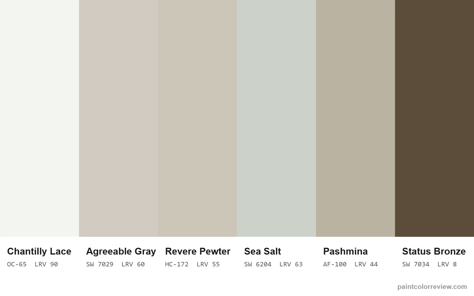
To choose a paint color, start with what you can't change (floors, counters, tile), decide how the room should feel, check which way it faces, pick how light the color should be (LRV), match its undertone to your finishes, then test two or three large samples in your own light before you buy.
Step 1: Start with what you can't change
Before you look at a single paint chip, list the things in the room that are staying: floors, countertops, tile, fireplace stone, large furniture and fabrics. Note whether each one is warm (orange or yellow wood, cream stone, brass) or cool (gray stone, white marble, chrome, blue fabrics). Your paint color has to get along with all of them, and the most common reason a well-loved color looks wrong in a room is an undertone clash with a fixed finish.
Step 2: Decide what the room should feel like
Bright and airy, calm and cozy, crisp and modern, or dramatic? Light whites and soft greiges open a space up; warm beiges and taupes make it feel enclosed and cozy; deep colors create drama and hide less-than-perfect walls. Decide the feeling first and you'll rule out most of the fan deck in seconds.
Step 3: Check which way the room faces
Natural light changes paint more than anything else:
- North-facing rooms get cool, indirect light all day. It mutes warmth and pushes grays toward blue or green, so warm whites and greiges usually look best.
- South-facing rooms get warm, strong light. Almost any color works, and cool colors look softer here.
- East-facing rooms are warm and bright in the morning and cooler in the afternoon.
- West-facing rooms are cooler during the day and glow warm at sunset.
Every color review on this site shows simulated north, south, east and west previews so you can see the shift before you buy samples.
Step 4: Choose how light the color should be (LRV)
Light reflectance value (LRV) tells you how light a color will look, from 0 (black) to 100 (white). As a rule of thumb: whites for ceilings and trim sit above 80; whole-house wall colors usually sit between 55 and 75; accent and cabinet colors go lower. Dim rooms need higher LRVs. Our LRV guide explains the ranges in detail.
Step 5: Pick the undertone
Once you know roughly how light the color should be, compare a few options at a similar LRV. At the same lightness, the undertone is what you'll actually see. Match it to Step 1: warm finishes suit warm, beige undertones; cool finishes suit cleaner grays and whites. See our paint undertones guide for how to spot them.
Step 6: Build a simple palette
A widely used interior design guideline is the 60-30-10 rule: about 60% of the room in a main color (usually the walls), 30% in a secondary color (furniture, an accent wall, cabinets) and 10% in an accent (pillows, art, a front door). For paint, that often means:
- A main wall color, such as a soft greige like Agreeable Gray.
- A white for trim and ceilings, such as Chantilly Lace for crisp contrast or White Dove for a softer look.
- One deeper color for doors, an island or cabinets, often a darker shade from the main color's own strip.
Every review lists the brand's own coordinating colors, which are a reliable starting palette.
Step 7: Test samples the right way
- Narrow it to two or three colors. More than that and the differences blur.
- Use large samples. Paint sample boards or large swatches; tiny chips make every color look the same.
- Test on more than one wall. Put samples on the brightest and the darkest wall of the room, and next to your trim, floor and counters.
- Look at them all day. Check morning, midday, evening and under your own bulbs at night.
- Test in the right sheen. Shinier finishes look slightly lighter; see the paint sheen guide.
Step 8: Think about the whole house
If rooms connect, choose colors from the same family of warmth so they flow. Many people use one versatile neutral throughout, varying only the sheen or using a lighter or darker shade in particular rooms. Browse the white paint colors and greige paint colors pages to compare options across both major brands.
Common mistakes to avoid
- Choosing from a screen. Monitors and phones change color; use the hex value for mood boards but always confirm with a physical sample.
- Ignoring fixed finishes. A cool gray with orange oak floors, or a creamy white next to stark white quartz, are the classic clashes.
- Going too light in a dark room. A bright white in a dim north room often looks gray and flat; a soft mid-tone can look brighter.
- Judging in one light. A color you love at noon can look completely different at night.
Start from something you already love
If you are stuck, choose the rug, artwork, fabric or tile first and pull the paint color from it. Wall colors are usually lighter and grayer than the colors in a pattern, so pick the softest neutral in the piece and look for a paint one or two steps lighter. That way the walls support the thing you love instead of competing with it.
Choosing colors for an open floor plan
In open spaces you see several areas at once, so the colors have to work together from every angle.
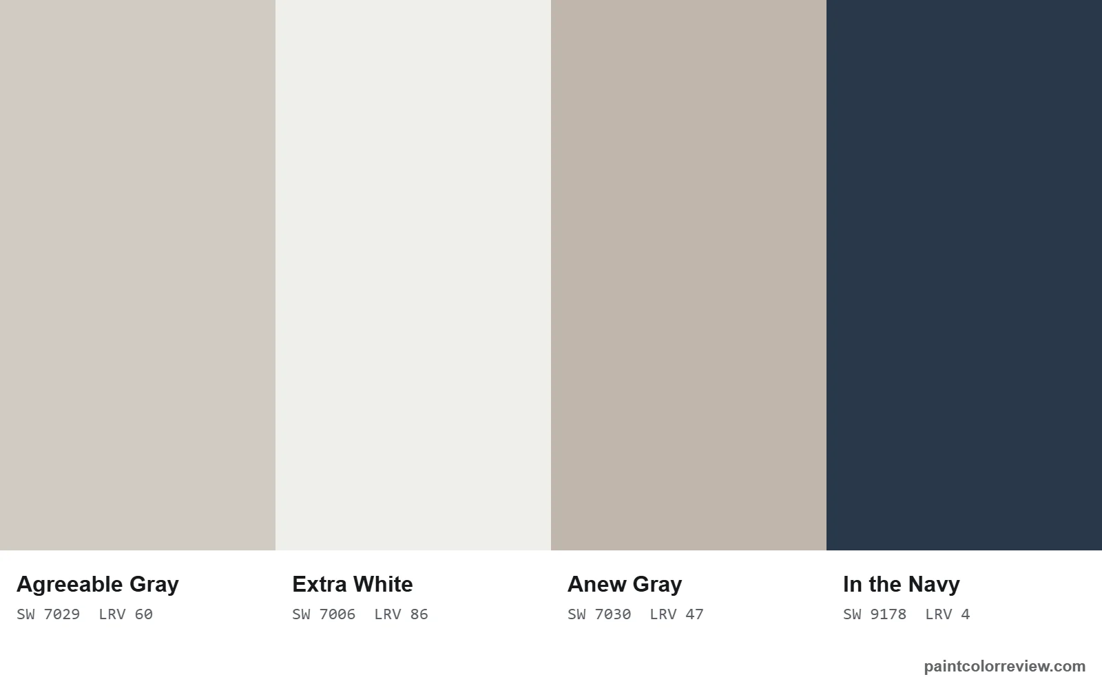
- Use one main color for connected spaces. A versatile neutral on all the walls you can see together keeps the space calm. Agreeable Gray and White Dove are common whole-house choices for this reason.
- Change color only at a natural break. An inside corner, a doorway or a change in ceiling height. Never in the middle of a flat wall.
- Keep the undertone consistent. If you use two colors, keep them in the same warmth family, for example a greige and a deeper shade from its own strip.
- Use the strip for depth. Going one or two steps deeper on the same strip for a den, an island or a feature wall keeps everything related.
Walls, trim and ceilings together
Most rooms look finished with a white or very light ceiling, trim one step brighter than the walls, and walls in the main color. If the walls are already a white, painting walls and ceiling the same white in different sheens makes a room feel taller and calmer. In rooms with low ceilings, avoid a dark ceiling unless you want a cozy, enclosed feel.
FAQs
How do I choose a paint color for a room?
Start with the finishes you can't change, decide the mood, check which way the room faces, choose how light the color should be (LRV), match the undertone to your finishes, then test two or three large samples in your own light.
What paint color makes a room look bigger?
Lighter colors with a higher LRV reflect more light and usually make a room feel more open, especially when walls and trim are close in color.
What color is best for a north-facing room?
Warm colors usually look best, such as warm whites, beiges and warm greiges, because north light mutes warmth and can make cool colors feel cold.
How many paint samples should I test?
Narrow it to two or three, and test them as large samples on more than one wall, viewed at different times of day.
What is the 60-30-10 rule?
A design guideline: about 60% of a room in a main color, 30% in a secondary color and 10% in an accent color.
Should walls and ceiling be the same color?
It can work well with whites and very light colors, especially in small rooms, using flat on the ceiling and a slightly shinier sheen on the walls. With mid-tone wall colors, a white ceiling usually looks brighter and cleaner.
How do I choose paint colors for an open floor plan?
Pick one main color for the walls you can see together, change colors only at corners or doorways, keep every color in the same warmth family, and use deeper shades from the same strip for accents.