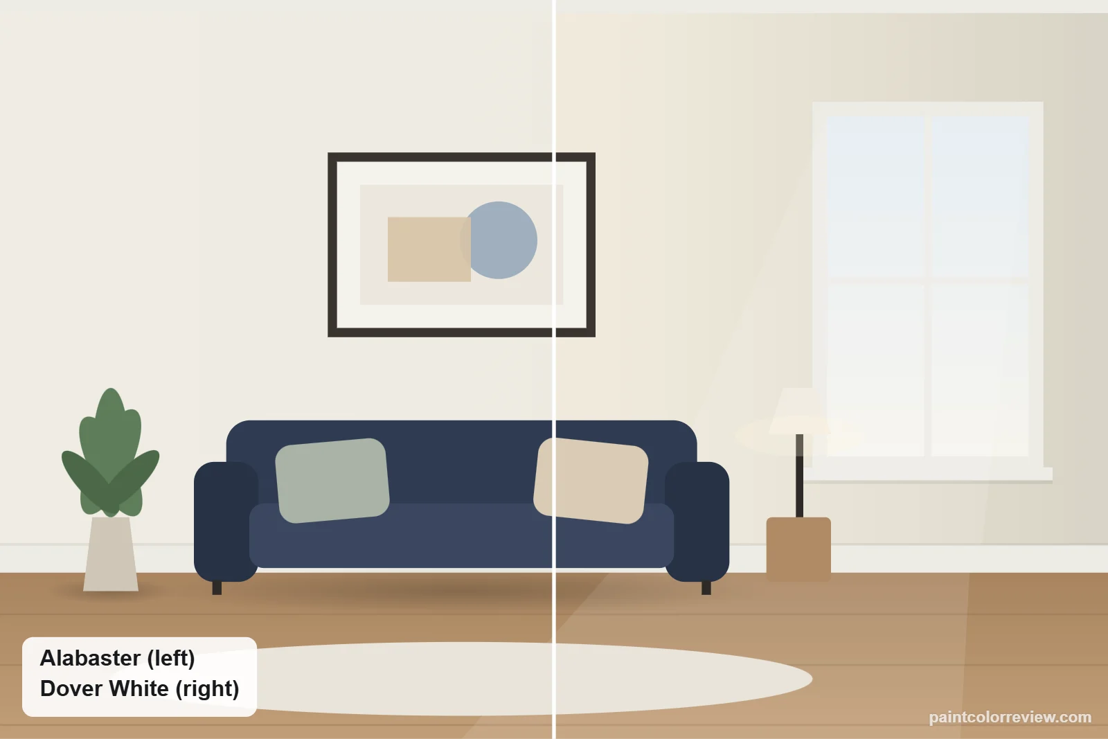
Alabaster (SW 7008) and Dover White (SW 6385) are two of Sherwin-Williams’ most used warm whites, and both turn up on walls, cabinets, trim and exteriors. They are equally bright, so the choice comes down to how much cream you want.
Side-by-side numbers
| Alabaster | Dover White | |
|---|---|---|
| Brand | Sherwin-Williams | Sherwin-Williams |
| Code | SW 7008 | SW 6385 |
| Hex | #EDEAE0 | #F0EADC |
| RGB | 237, 234, 224 | 240, 234, 220 |
| LRV | 82.2 | 82.5 (lighter) |
| Yellow–blue (b*) | +5.2 | +7.5 (warmer) |
| Green–red (a*) | −0.7 | −0.3 |
| Difference (ΔE) | 1.9 |
Hex, RGB and LRV from the manufacturers' color records. CIELAB values and ΔE (CIEDE2000) calculated from those hex values.
Dover White is a touch brighter (LRV 82.5 vs 82.2), which you will not notice. The measured difference is 1.9: hard to see on small chips, visible on two large boards side by side, and obvious if both end up on the same wall.
Undertones: Alabaster vs Dover White
The difference is yellow. Dover White measures +7.5 on the yellow–blue scale against Alabaster’s +5.2, so it reads as a soft cream almost everywhere. Alabaster is closer to neutral and has a faint green-gray lean (−0.7 green–red), which is why it can look slightly greige in dim light. Neither has a pink or peach undertone in the manufacturer values.
How they compare in each light
North light suits Dover White, whose extra yellow keeps the room from looking gray; Alabaster can go a little flat and greige there. In bright south or west sun Dover White can turn noticeably yellow, while Alabaster holds a softer white. Under warm bulbs both look creamy; under cool LEDs Alabaster looks whiter.
Simulated from the manufacturer's color values. Always test samples in your own light.
Which one fits your room?
Choose Alabaster if…
- You want a warm white that still reads as white
- Your room is bright, south- or west-facing
- You need a versatile trim white for many wall colors
Choose Dover White if…
- You want a clear, consistent cream
- Your room faces north or gets little light
- You have honey oak, butcher block or other warm wood to match
Where each one works
Living rooms and bedrooms
In a dim or north-facing room, Dover White keeps walls feeling warm and lit. In a sunny room, Alabaster gives warmth without turning yellow by mid-afternoon.
Kitchen cabinets
Dover White suits warm kitchens: butcher block, honey oak floors, cream or beige stone and brass. Alabaster suits white or marble-look quartz and stainless steel, where Dover White’s yellow would show.
Trim
Alabaster is the safer trim white. Dover White trim can make neutral or gray walls look grayer, and sometimes greener or purpler, by contrast. Use Dover White on trim only when the walls are warm too, such as beige or tan.
Exteriors
In full sun Alabaster looks whiter and cleaner; Dover White stays cream. Dover White pairs well with warm stone, red brick and brown or tan roofs. Alabaster works with more roof and stone colors, including gray.
Can you use Alabaster and Dover White together?
Not on neighboring surfaces. At 1.9 apart they look like two slightly different whites, which reads as a mistake where trim meets wall. If you want a two-white scheme, pair either one with a clearly brighter trim such as Pure White or Extra White instead.
Trim and colors to pair with each
Alabaster pairs easily with greiges such as Agreeable Gray and Repose Gray, and with dark accents such as Iron Ore. Dover White suits warmer beiges and tans, such as Accessible Beige, plus warm wood and brass.
If neither is quite right
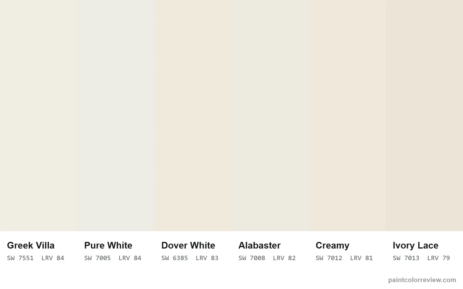
For a creamier white still, Creamy (LRV 81.2) is close to Dover White. For a warm white a little brighter than Alabaster, with the same gentle warmth, Greek Villa (LRV 84.2). For a near-twin of Alabaster from Benjamin Moore, Swiss Coffee is only 0.8 apart; see Alabaster vs Swiss Coffee.
Read the full reviews
Alabaster review · Dover White review · Alabaster vs Creamy
Alabaster vs Dover White FAQs
Is Dover White warmer than Alabaster?
Yes. Dover White measures +7.5 on the yellow–blue scale against Alabaster’s +5.2, so it reads as a clearer cream.
Is Dover White darker than Alabaster?
No. Dover White is a fraction brighter, LRV 82.5 against 82.2. The visible difference is warmth, not depth.
Does Dover White look yellow?
It can, especially in strong south or west sun and next to bright white surfaces. In north light and with warm wood it reads as a soft cream.
Does Alabaster look too yellow?
Rarely. It is warm but close to neutral, and in dim rooms it leans greige rather than yellow.
Which is better for kitchen cabinets?
Dover White for warm kitchens with wood and cream stone; Alabaster for white or gray quartz and stainless steel.
Which is better for trim?
Alabaster. It works with more wall colors. Dover White trim can make gray or neutral walls look grayer by contrast.
Which is better for exteriors?
Alabaster for a white that stays white in sun; Dover White for a cream house with warm brick or stone.
Can I use Alabaster and Dover White in the same house?
Yes, in different rooms. Avoid putting them on neighboring surfaces such as walls and trim, where the 1.9 difference looks like a mismatch.